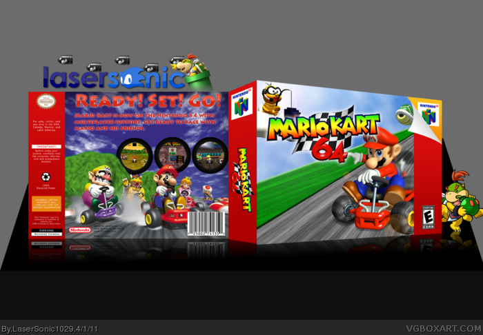
The front looks a little empty, and a little unnatural without the mountains and trees masking the horizon. It looks as if the world is flat.
You should design the back with backgrounds behind the text so that it looks presentable. Using the outer glow to coincide with the current background looks a little amateurish.
 Mario Kart 64 Box Cover Comments
Template by Del337er
Every else on Google image
Well, enjoy
[ Reply ]
The front looks a little empty, and a little unnatural without the mountains and trees masking the horizon. It looks as if the world is flat.
You should design the back with backgrounds behind the text so that it looks presentable. Using the outer glow to coincide with the current background looks a little amateurish.
Nonetheless, not bad. Just needs improvement.
[ Reply ]
#2, ok I will try to fix those things
[ Reply ]