![]() »
»
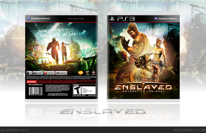
[ Box updated on April 16th, 2011 ] [ original ]
 Enslaved: Odyssey to the West Box Cover Comments
Comment on sd1833's Enslaved: Odyssey to the West Box Art / Cover.
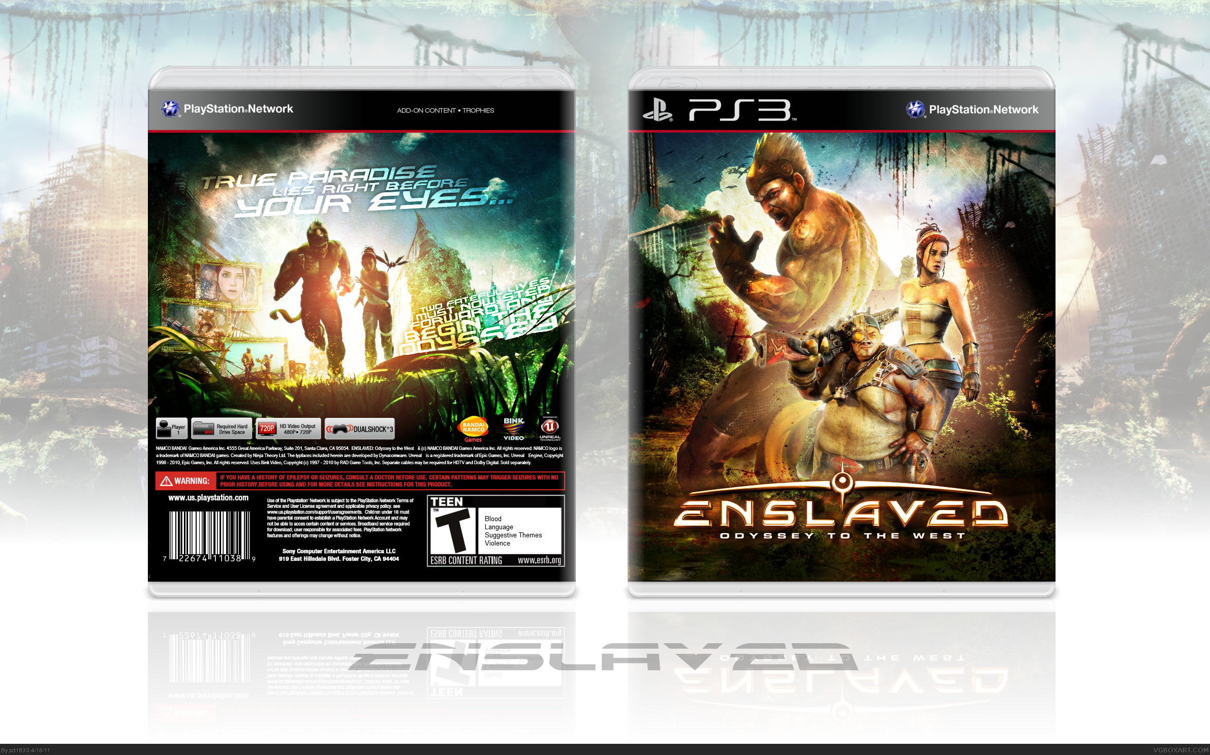
More of a chance for me to practice my skills with colors and lighting than anything else. Was fun experimenting.
Comments are always welcome.
[ Reply ]
Definitely not your best but still pretty good.
You are missing the ESRB and dev logos though.
[ Reply ]
#2: I agree, but of course I'm not always trying to top myself. As for ESRB, it's supposed to be a slip cover, which is basically just an excuse for me to have more room to drop the logo. Similar to what I did with my Other M design.
[ Reply ]
I like the way the front comes together, overall the cover looks too bright in some areas. The back has a nice screenshot setup but it's kind of hard to see because all of the light drains it out.
On the back the lighting is well done but it seems spotty. There is light coming from behind them but the sky varies in light and color a lot, the back also seems very scratchy especially around the text.
[ Reply ]
#4: Thank you for the criticism. However, I'll have to disagree with you regarding the spotty lighting. Any variations in lighting are simply clouds, which have tendency of being white. I do see what you mean about the inconsistence color in the sky though, and have updated to remedy the issue.
As for the screenshots or text possibly being difficult to see... I wanted to try something different, outside of the generic lays or simply placing the screenshots over top of the image. I tried it, it didn't look right and felt lazy. integrating it into the scenery seemed like a good idea, and while I can't perfect it with my current skills, I just wanted to experiment with the concept for this and hopefully future designs.
[ Reply ]
Beautiful box. The contrast a bit high to me but great work anyway!
[ Reply ]
I love this box! I think the bright colours suit it really well :D Woah that back cover is Wonderful The simple feel to it is just Amazing! ^^ Fav+
[ Reply ]
#3, Thats what I always say but people dont seem to understand that. The front is pretty good. But the arrangement is pretty original. But like you said your not trying to top your last which is good. I do like the back. Although it does feel kind of empty.
[ Reply ]
#6-7: It's great appreciated guys, thanks.
#8: Exactly, referring to the lack of ESRB/developer logos. Obviously I'm creating a cover art, but in the event that it's too low-res to print or simply not intended in that manner, I prefer to place the design itself ahead of the official aspects of a case. This would be one of those times.
[ Reply ]
Looks hawt bro.
[ Reply ]
SEX.
[ Reply ]
Thanks you two.
[ Reply ]
When I saw the thumbnail I thought Klaatu had made this. :P
Great work dude!
[ Reply ]
I love the typography on the back.
[ Reply ]
Very cool, I like it, great colouring indeed
[ Reply ]
Wow, these screenshots look really nice, although I'm not too fond of the front's layout as well as the empty space around the tagline and the way it seems randomly inclined.
Good looking and has great colors, nevertheless.
[ Reply ]
Excuse me while I masturbate.
[ Reply ]
I love the back, like alot. I can see what you were trying to do with the front composition but i think something like that would work better with more than just 3 characters. I really like this overall though, the colours look great:)
[ Reply ]
Unnnnnnnn
[ Reply ]
Perfect
[ Reply ]
Great to see another cover from you, sd. :)
[ Reply ]
#13: Thank you, that's quite the compliment.
#14: I'm relieved to know my efforts in more creative typography paid off.
#15/16/17/20/21: Thanks you guys.
#18: I agree. The only problem was, that there are only three characters in the game's cast. Plus there's few to no artwork of the game's enemies.
#19: Thanks, I think?
[ Reply ]
One Word ---> F.A.N.T.A.S.T.I.C
[ Reply ]
#5, When I'm mentioning the lighting, What I mean is that, I feel sorry to keep repeating this, but your covers to me, are brought down by all of the filters, high contrast and lighting, everything is drowned in it, the text on the back is very hard to see. All of the splatters and white variations and brushes makes everything look low in quality and scratchy, and I think that if you tried to abandon this technique your covers would better to me. It works for the most part, but it's not for me.
[ Reply ]
I really love the colors on this cover, but I have to agree with #24. Often times, you bring yourself down with the different filters and in this case, the lighting. The lighting behind the characters on both the front and back is way too much. I like the grungy texture work but everything looks over-sharpened and the description text is a bit of an afterthought. The legal text looks extremely low quality.
[ Reply ]
Personally, I love the colours and what you've done with the art. The composition is top-notch, even, if you say, you weren't trying to top your last.
[ Reply ]
#24: I appreciate your opinion on the matter, although that's all very subjective. I added no filters to this design, outside of a texture overlay. No film grain was added, nor scanlines or abstract grids/shapes as I used to. The editing is credited almost entirely to playing around with the brightness/levels and coloring. And I'm sorry you have an issue in that regard, but strong colors and lighting are a staple in my designing style, as you can no doubt see from the large majority of my designs. I respect that it's not for you, but I doubt I'll be abandoning this style anytime soon.
#25: What I said to #24. I can assure you the synopsis was not an afterthought. I spent a good amount of time thinking of how to implement it into the case without obstructing the artwork. As for the legal text, I'm not sure what to tell you. Nothing was done to it, outside of simply typing it out.
#25: Thanks, Sarashi, I'm glad you like it.
[ Reply ]
#27, Which isn't a problem.
Your ability to take criticism is the reason I why respect you.
[ Reply ]
I really like it a lot!! The lighting is great for me. Only thing I don't like is that third miniature dude in the middle of the front. He looks out of place and ehhh, it would look waaay better if you removed him.
[ Reply ]
I haven't really heard of this game but WOW, Seeing this box art makes me want to buy the game right away!
Fantastic design here. Love the position of the text and screen shots on the back and the front looks great too. HOF I hope!
[ Reply ]
looks nice.
[ Reply ]
I really like this, but I'm not a fan of the lack of developer logos and an ESRB rating.
[ Reply ]
Also, it's weird that Pigsy is in from of Monkey and Trip because it implies that he's the main character.
[ Reply ]
I'm surprised this made to the HOF and not because it's a bad design (because it is now, it's a great cover) but because I thought the website doesn't have enough active members to actually fav the box and make it to the Hall. I guess I was wrong...
[ Reply ]
#34, It also depends on the person posting it.
[ Reply ]
Edited at 1 decade ago
[ Reply ]
#27: Thank you, Thro.
#29: I considered having Trip and Monkey alone. The outcome was not only a bit generic (that's a pretty basic layout), but the design I wanted would need as many characters as I could find. Seeing as how that number maxes out at 3, there was little else I could do.
#30/31: Thanks.
#32/33: I felt that if I made Pigsy small enough, and slightly off center, it wouldn't give the implication of being the main character. It's also why Monkey is larger than the other characters, almost dominating the cover. I can understand why one would think differently though, thanks for giving your input.
#34: I was genuinely surprised to see such a large reaction. But I appreciate it, of course. Thanks again for your own feedback.
#35: That can be true, sadly.
[ Reply ]
#27, Yea I noticed that sometimes text comes out really choppy on Photoshop.
[ Reply ]
love the bright colours and is really inspired
[ Reply ]
FANTASTIC
[ Reply ]
I need the printable version
[ Reply ]
I need the printable version
[ Reply ]
OMG!!!
[ Reply ]