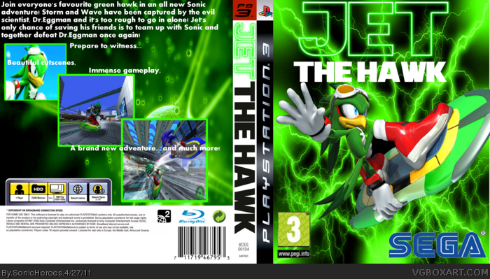
It's not good, but it's not bad either, the SEGA logo is kind-of choppy, there is no rating on the back, the background's just green lightning, and I'm not a very big fan of the logo. The border of the screenshots aren't good, and the back isnt good all together, the front is alright, but it needs some works.
I definitely see potential, but there are some things you need to do. You need to stop using such abstract backgrounds. Also, you need to add more to the front, the game may be about Jet, but I'm sure he wouldn't be the only character in the game....hopefully. I agree with Luigi53, the back isn't very good and some of the images are blurry and choppy. Also, I think you should use different screenshots, Kind of like this: link link
Hope I could help.
2.5/5 for now
Credit goes to Thewill for his Jet The Hawk SSBB hack and pictures
 Jet The Hawk Box Cover Comments
It's not good, but it's not bad either, the SEGA logo is kind-of choppy, there is no rating on the back, the background's just green lightning, and I'm not a very big fan of the logo. The border of the screenshots aren't good, and the back isnt good all together, the front is alright, but it needs some works.
[ Reply ]
#1, Thanks, Finally a truthful review on one of my boxes! n__n
Btw, I'll do my best to improve.
[ Reply ]
I definitely see potential, but there are some things you need to do. You need to stop using such abstract backgrounds. Also, you need to add more to the front, the game may be about Jet, but I'm sure he wouldn't be the only character in the game....hopefully. I agree with Luigi53, the back isn't very good and some of the images are blurry and choppy. Also, I think you should use different screenshots, Kind of like this: link
link
Hope I could help.
2.5/5 for now
Credit goes to Thewill for his Jet The Hawk SSBB hack and pictures
Edited at 1 decade ago
[ Reply ]
#3, Thanks for the review and thanks for the awesome screenshots! I might use them in the near future.
[ Reply ]