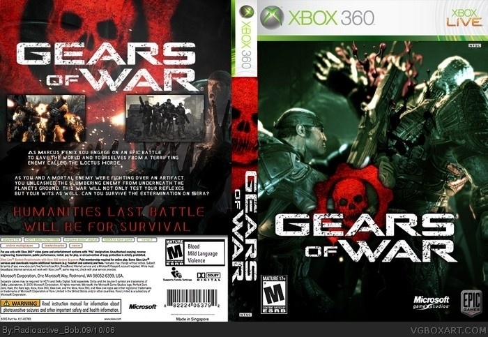
i deleted this because i spelt survival wrong, then i had problems resubmiting, so if you sawe it, and then didn't see it back on for a while, that's why. Anyways, i hope you like this as a lot of work wet into fit. :)
#2, thanx, but there's 2 problems about putting it in 3D
1. i don;t want to learn how to use Imandix (i hear it's confusing)
2. people complain about too much white space and stuff, which, i think, detracts from the box. Not to say 3D boxes are bad, but there's other problems as well, like it becomes blurry and stuff. But thanx for the rating =D
#3, have you seen my boxes? =P
anyhoo
The back is definately better than before, but its still not as good as some others. mostly, its the descriptions of the features. the design ois really good, but the text needs work.
#4, thanx Monk!
#5, i'll try some other text, i'm not too good at giving descriptions.
#6, you've only made one or two and they were blurry, read comment #3
wow, thanx General! i'm glad you ike it. :)
anyways, i made the spine a bit more different and changed all the text on the back (other than the slogan)
Enjoy ;)
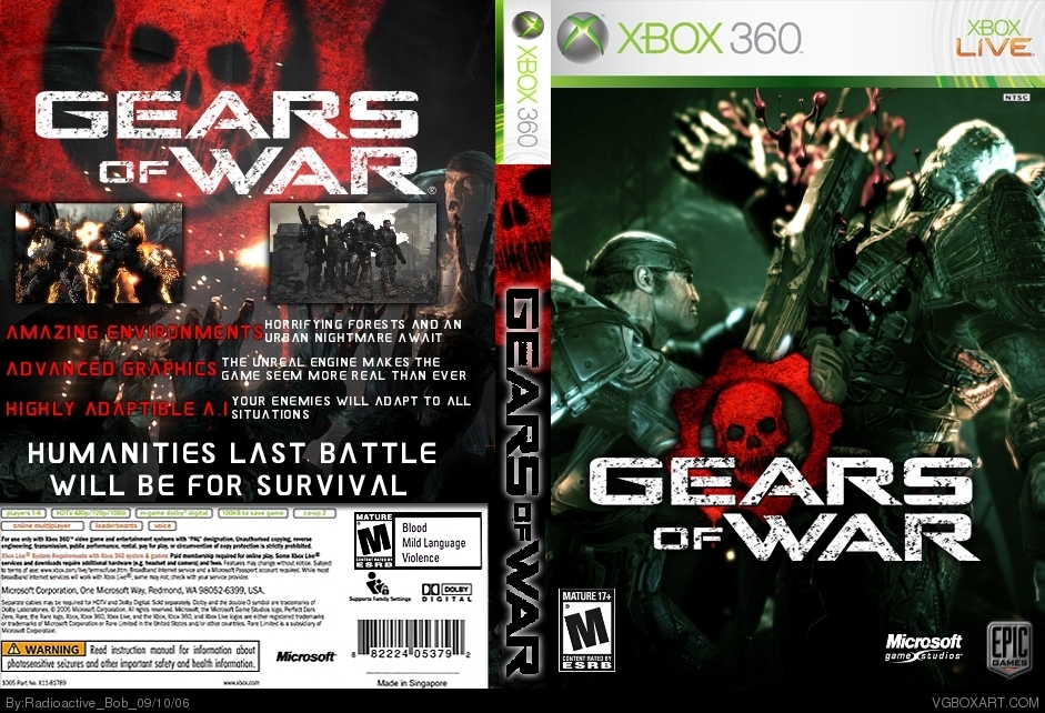
I canÂ’t read the red writing that much at all now; you should change it white or make the background brighter with a transparent brush or something, but fast update!!!
 Gears of War Box Cover Comments
i deleted this because i spelt survival wrong, then i had problems resubmiting, so if you sawe it, and then didn't see it back on for a while, that's why. Anyways, i hope you like this as a lot of work wet into fit. :)
[ Reply ]
looks nice but would be better in 3d
4.5/5
[ Reply ]
#2, thanx, but there's 2 problems about putting it in 3D
1. i don;t want to learn how to use Imandix (i hear it's confusing)
2. people complain about too much white space and stuff, which, i think, detracts from the box. Not to say 3D boxes are bad, but there's other problems as well, like it becomes blurry and stuff. But thanx for the rating =D
[ Reply ]
I like the front cover, the font on the spine is a little choppy. Other then that its sweet.
[ Reply ]
#3, have you seen my boxes? =P
anyhoo
The back is definately better than before, but its still not as good as some others. mostly, its the descriptions of the features. the design ois really good, but the text needs work.
[ Reply ]
hey mikey have you ever considered asking a friend with imandix who could easily convert this to a 3-d box for you ;)
[ Reply ]
#4, thanx Monk!
#5, i'll try some other text, i'm not too good at giving descriptions.
#6, you've only made one or two and they were blurry, read comment #3
[ Reply ]
I think thatÂ’s one of your best, I think this one is better in 2D, IMAX is easy, but the detail on this shows, very nice job.
[ Reply ]
wow, thanx General! i'm glad you ike it. :)
anyways, i made the spine a bit more different and changed all the text on the back (other than the slogan)
Enjoy ;)
[ Reply ]
I canÂ’t read the red writing that much at all now; you should change it white or make the background brighter with a transparent brush or something, but fast update!!!
[ Reply ]
here's your helpful dose of update goodness. (if your wondering why i constintly want to have red text, it's because it looks too plain otherwise)
[ Reply ]
Well its better a small percentage dull than not being able to read it clearly.
[ Reply ]
#12, so... i guess you like it now more?
oui ou non?
[ Reply ]
Nice you fixed the spine! much better.
[ Reply ]
wow, of all my boxes, i think this is the 3rd one you've posted on :P
(excluding your earlier comment)
thanx Monk.
[ Reply ]