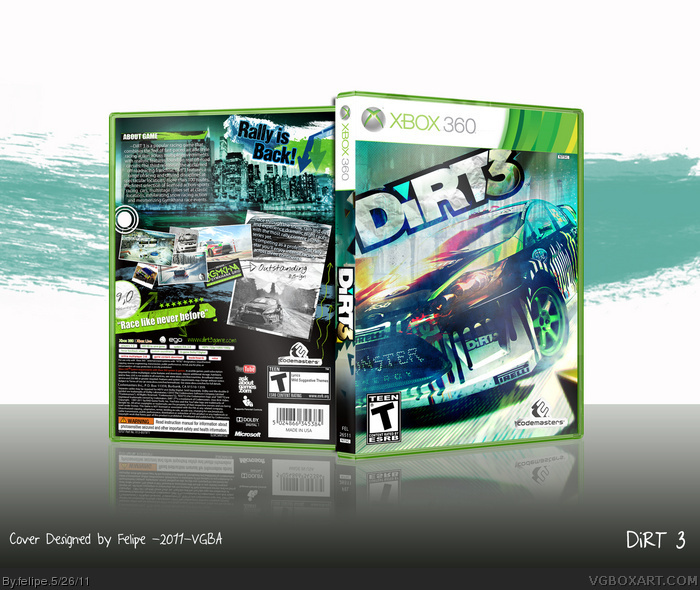
What's up folks?
after 3 months without making anything, this is my newest design, I spent a lot of time on this one, aproximately 1 month...This box was a pain in the ass to complete, because photoshop crashed a lot of times while doing it...the PSD file is around 400 MB, really heavy...
Thanks to everyone who helped me in the Wip...
I hope you enjoy this one! A lot of effort was put into it. Printable will be up soon...
Looking pretty nice, I like what you did with the screenshots. I just disliked the description text. It's hard to read and the font is too simple in my opinion.
#9, Thanks dude, I think you should take a look at the printable version, the text is easy to read and I used a more casual font for the description this time...my main goal was make everything easy to read...
10,11# thanks a lot guys!
#12, I did look at the printable but the city background behind the text is too distracting. You could simply increase opacity of the text box and it should look fine (at least that's what I would do).
 Dirt 3 Box Cover Comments
Presentation's a little big but it's still amazing, great job.
[ Reply ]
Front is kinda generic, but still amazing box.
[ Reply ]
Nicely done. Great colors, and I like the layout on the back. The scattered papers and graffiti are a good fit for the nature of the game.
Do you have a printable?
Edited at 1 decade ago
[ Reply ]
It looks really cool although I don't like the description text over a busy background like that.
[ Reply ]
Nice job man!
[ Reply ]
What's up folks?
after 3 months without making anything, this is my newest design, I spent a lot of time on this one, aproximately 1 month...This box was a pain in the ass to complete, because photoshop crashed a lot of times while doing it...the PSD file is around 400 MB, really heavy...
Thanks to everyone who helped me in the Wip...
I hope you enjoy this one! A lot of effort was put into it. Printable will be up soon...
Edited at 1 decade ago
[ Reply ]
I love it, but one problem. WHERES THE PRINTABLE?!
[ Reply ]
Thanks guys! Printable added!
[ Reply ]
Looking pretty nice, I like what you did with the screenshots. I just disliked the description text. It's hard to read and the font is too simple in my opinion.
[ Reply ]
Good job, I just don't like the front too much. :D
[ Reply ]
HOLY FUDGE!!! It keeps getting better the more I look!
FAV+AUTOR FAV
[ Reply ]
#9, Thanks dude, I think you should take a look at the printable version, the text is easy to read and I used a more casual font for the description this time...my main goal was make everything easy to read...
10,11# thanks a lot guys!
[ Reply ]
#12, I did look at the printable but the city background behind the text is too distracting. You could simply increase opacity of the text box and it should look fine (at least that's what I would do).
[ Reply ]
The back is very well laid out, great job Felipe!
[ Reply ]
Thanks a lot guys!
[ Reply ]
I popped a boner.
[ Reply ]
Lol, thanks by the favs guys!
[ Reply ]
This is just awesome! Very official looking and I love the colors, great job.
[ Reply ]
Thanks Josh!
[ Reply ]
Please View this:
link
[ Reply ]