One of my housemates and I have been arguing over 28 Days Later lately. When I saw it in theaters back in 2003, I really didn't like it at all. It was before I had really started digging deep into horror and seeing what there was and wasn't. As time went on, 28 Days Later grew on me, to the point of being in my top ten films list now.
I wanted something very sleek and minimalistic, which goes completely against the film, but I think it is a film you should go into knowing as little as possible. The first time you see the bridge scene, it's awe-inspiring.
Don't have much else to say, but hope you enjoy it. Template from Indexenos, image from Google.
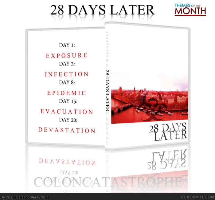
#4, I wanted to try and keep some remnants of the actual film, which is why the image of London is red and has the biohazard symbol. I know it isn't completely subtle, but it's a hint for the film...
SPOILER ALERT!!!! SPOILER ALERT!!!! DO NOT READ ANY FURTHER IF YOU DON'T WANT THE FILM RUINED!
I put the biohazard sign over the image of London because in the film, it is revealed beautifully that there are others alive around the world... In fact, there are commercial planes overhead. The main character Jim slowly realizes that the rest of the world is fine and that the U.K. has been quarantined off from the rest of the world to contain the virus. I could put the symbol in the sky, but I think it has more impact over London since the white space could signify the sky and the rest of the world, without worries and fine, and Britain down below, red, almost like hell.
You never disappoint. 28 Days Later is one of my favorite movies, and while I liked the design from the beginning, after your explanation regarding the cover, I fell in love with it.
#9, I appreciate that very very much! It's nice to know that what I am doing does appeal to others! But, I do have a question...
SPOILERS AGAIN!
Since there is life in London in the image I used on the cover, I was thinking of putting DAY 1: EXPOSURE on the white space for the cover, but it would throw the entire back off, which means I would have to figure out some way to incorporate the rest, or just leave it the way it is. Any ideas?
#10, go watch! Soon! It's semi-low budget, but what was achieved in the film is even insane for high budget films. DO IT!
I appreciate that sir, but I'm just not big on the white biohazard sign. I prefer that it be somewhat ominous, and the way I see it, an opaque biohazard sign almost represents the government being 100% honest the day of exposure, causing riots and panic. Having it blend in, I feel like it represents more of a quiet whispering... People hearing about a virus spreading but not being told everything.
As for the pink smoke, it was actually just clouds.
I think it would be great to have "Day 1: Exposure" on the negative space of the cover. You could just put Day 3 and onward on the back, it works since that would be the order in which a person would look at the case anyway.
I figured that might work a little bit better, but I just wasn't 100% sold on the idea at first. I'll throw that on there tonight after work and upload it in the next day or two. I appreciate all the comments and help guys!
I'm appreciating the thought that went into this as I examine both it and your explanation of the choices made in the design. Using the empty white space as symbolization of an integral part of the movie's story, rather than simply to push the "clean and simple" theme, is a brilliant idea.
I really like the white space below the image on the front. You should keep it that way. I'm not a fan of the biohazard symbol, or the pink smoke, but other than that this is nice.
#20, thanks good sir! I have an updated version with DAY 1: EXPOSURE on the front and the smoke removed, but now I just have to get a little time to slap it on a template. I'll update it tomorrow or Wednesday and hopefully it'll be looking a little bit more complete!
 28 Days Later Box Cover Comments
Here's my Theme of the Month entry.
One of my housemates and I have been arguing over 28 Days Later lately. When I saw it in theaters back in 2003, I really didn't like it at all. It was before I had really started digging deep into horror and seeing what there was and wasn't. As time went on, 28 Days Later grew on me, to the point of being in my top ten films list now.
I wanted something very sleek and minimalistic, which goes completely against the film, but I think it is a film you should go into knowing as little as possible. The first time you see the bridge scene, it's awe-inspiring.
Don't have much else to say, but hope you enjoy it. Template from Indexenos, image from Google.
[ Reply ]
I like what you've done with this! great job. Really love the back.
[ Reply ]
Thank you very much!
Also, just one little note, I was inspired by this:
link
[ Reply ]
I'm not sure how I feel about the Hazard symbol on the front, but other than that, this is great!
[ Reply ]
Nicely done. I'm liking this one.
[ Reply ]
#4, I wanted to try and keep some remnants of the actual film, which is why the image of London is red and has the biohazard symbol. I know it isn't completely subtle, but it's a hint for the film...
[ Reply ]
My only problem is with the bio-hazard sign. I think it should be up in the white space.
[ Reply ]
SPOILER ALERT!!!! SPOILER ALERT!!!! DO NOT READ ANY FURTHER IF YOU DON'T WANT THE FILM RUINED!
I put the biohazard sign over the image of London because in the film, it is revealed beautifully that there are others alive around the world... In fact, there are commercial planes overhead. The main character Jim slowly realizes that the rest of the world is fine and that the U.K. has been quarantined off from the rest of the world to contain the virus. I could put the symbol in the sky, but I think it has more impact over London since the white space could signify the sky and the rest of the world, without worries and fine, and Britain down below, red, almost like hell.
[ Reply ]
You never disappoint. 28 Days Later is one of my favorite movies, and while I liked the design from the beginning, after your explanation regarding the cover, I fell in love with it.
[ Reply ]
I'm not too keen myself. I Love the back but the front doens't really appeal to me. Maybe because I haven't seen the film but IDK.
[ Reply ]
#9, I appreciate that very very much! It's nice to know that what I am doing does appeal to others! But, I do have a question...
SPOILERS AGAIN!
Since there is life in London in the image I used on the cover, I was thinking of putting DAY 1: EXPOSURE on the white space for the cover, but it would throw the entire back off, which means I would have to figure out some way to incorporate the rest, or just leave it the way it is. Any ideas?
#10, go watch! Soon! It's semi-low budget, but what was achieved in the film is even insane for high budget films. DO IT!
[ Reply ]
I wonder how I would feel about it if the front image was extended all the way down and the bio-hazard logo was white.
I think it's pretty cool.
[ Reply ]
#12, that might just work. I'll give it a go within the next day or so and see how it turns out! Thanks for the idea!
[ Reply ]
Shit, double post. My apologies.
Edited at 1 decade ago
[ Reply ]
#13, I got bored and decided to do it for you. It's very quick but it's just an example of what I was saying.
link
I also got rid of that pink smoke on the right cause it looked out of place.
[ Reply ]
I appreciate that sir, but I'm just not big on the white biohazard sign. I prefer that it be somewhat ominous, and the way I see it, an opaque biohazard sign almost represents the government being 100% honest the day of exposure, causing riots and panic. Having it blend in, I feel like it represents more of a quiet whispering... People hearing about a virus spreading but not being told everything.
As for the pink smoke, it was actually just clouds.
[ Reply ]
I think it would be great to have "Day 1: Exposure" on the negative space of the cover. You could just put Day 3 and onward on the back, it works since that would be the order in which a person would look at the case anyway.
[ Reply ]
I figured that might work a little bit better, but I just wasn't 100% sold on the idea at first. I'll throw that on there tonight after work and upload it in the next day or two. I appreciate all the comments and help guys!
[ Reply ]
I'm appreciating the thought that went into this as I examine both it and your explanation of the choices made in the design. Using the empty white space as symbolization of an integral part of the movie's story, rather than simply to push the "clean and simple" theme, is a brilliant idea.
[ Reply ]
I really like the white space below the image on the front. You should keep it that way. I'm not a fan of the biohazard symbol, or the pink smoke, but other than that this is nice.
[ Reply ]
#20, thanks good sir! I have an updated version with DAY 1: EXPOSURE on the front and the smoke removed, but now I just have to get a little time to slap it on a template. I'll update it tomorrow or Wednesday and hopefully it'll be looking a little bit more complete!
[ Reply ]