I did want to know, Thro, why did you put "Official Site" in the lower right of the back? I know there is no official US/EU sites yet (to my knowledge) but I think that looks odd, and out of place for one of your works.
This box is on fire..haha.
Anyways, great cover as always. Very professional looking.
Few suggestions I would give you is to decrease the size of GameSpot logo and maybe increase the size of Capcom logo.
Also, I would like you to experiment more with your typography. Again, it seems to follow familiar style seen on your previous covers.
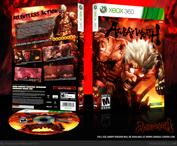
 Asura's Wrath Box Cover Comments
Damn, you beat me to being the first one. Looks authentic. You can expect a box of this from me in the coming days. Of course, mine will be PS3.
Great job, as always.
[ Reply ]
Whooh, that's hot.
[ Reply ]
This is awesome. I wanted to do a box for this like a month ago but there was no art.
[ Reply ]
#3, There's about four or five pieces now. A quick Google search should turn them up.
[ Reply ]
So EPIC! By the way... Is that my Disc Template there?
[ Reply ]
This game is so strangely appealing. This cover does it's quirky, insane style justice.
[ Reply ]
A lot of time was put into the cover, particularly, to keep everything completely original.
Edited at 1 decade ago
[ Reply ]
I like the front a lot. I like the back too..just not the gamespot logo :(
[ Reply ]
I did want to know, Thro, why did you put "Official Site" in the lower right of the back? I know there is no official US/EU sites yet (to my knowledge) but I think that looks odd, and out of place for one of your works.
[ Reply ]
This box makes me want to play the game... and I've never even heard of it.
+fav, sir.
Edited at 1 decade ago
[ Reply ]
Really awesome work here, as usual. You really pulled off making it more original, nice work.
[ Reply ]
#8, That will probably be taken out when the cover is officially released.
#9, It is a placeholder for when the US website comes up.
[ Reply ]
#12, I thought you would say that. Okay then.
[ Reply ]
Nice job I don't know much about the game itself but great cover.
[ Reply ]
As usual, a near-perfect box from you. I loved your use of the artwork, and the colours are awesome.
[ Reply ]
Thank you
[ Reply ]
This box is on fire..haha.
Anyways, great cover as always. Very professional looking.
Few suggestions I would give you is to decrease the size of GameSpot logo and maybe increase the size of Capcom logo.
Also, I would like you to experiment more with your typography. Again, it seems to follow familiar style seen on your previous covers.
[ Reply ]
man this is pure amazing!
[ Reply ]
damn....awsome.kindly make a printable
[ Reply ]
Throavium asked me to post this link for everyone interested. Enjoy.
link
[ Reply ]