Been replaying this amazing masterpiece of a game, and I thought to make a remastered boxset of it. Not really sure how I feel about it, though. I feel as though something's missing, or I coulda done something better.
Anyway C+C please ;)
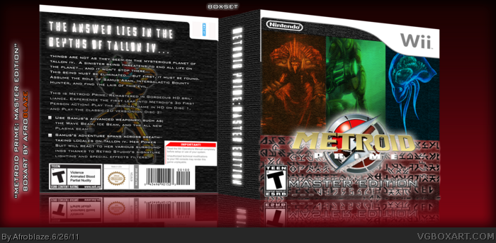
#4: Too much? Not really. Nothing is actually shown, and to say the truth it's a very nice piece of artwork.
The mixture of artwork from different games is an issue though. The back's image of Samus is from Zero Mission, not Prime.
I like the concept here, a collector-like edition using Chozonian(?) characters. The execution leaves something to be desired though. The white glows around the logo is unappealing, and the character lineup is a little boring.
EDIT: Ok so I swapped the picture of Samus. Hopefully the lastest is a bit more user-friendly. If you wanna see the previous version i think you can click the option. I'm not sure...still kinda new here.
#6, Appreciate the back-up on the picture issue. About the game art clash, I did that on purpose because one disc features the game in the original 3D fashion, while the second disc is the game in 2D form, like Zero Mission. Sorry I didnt get my point across.
#8: That's my fault. I should have payed closer attention while looking over the back. My other thoughts still stand. With improvements, this could be something quite nice.
I too like the concept, but I think it would be much better with some more work. A few things I have a problem with:
1. The template, especially where you cut off the legal info to fit more text onto the back. My suggestion would be to cut down on a lot of the text and use a proper template for the system. This one link in the resources section should work perfectly. Another problem I see with the template is the proportions, which is probably just the 3D. It looks much too short, wide, and deep to be a Wii box. There are some great 3D tutorials in the forums if you are interested.
2. The logo. Much of the logo is cut out, such as all of the black that should be in the center and around the Metroid logo. If you would like help rendering the logo, you can make a request in the forums or send me a PM and I would gladly help. The subtitle in the logo is also pretty hard to see due to the background image. Maybe adding a black glow or stroke would help out.
3. The textures. The textures and images on the front go well together, but maybe lowering the opacity some would help the Metroid images stand out more and give it a cleaner look. As for the back, you may want to go with a different image that goes with the game better. The tiles don't seem to fit with the rest of the box for me.
4. The back composition. I like the way the front is put together. The subtle images give it a good feel, but the back seems quickly put together. I think having a proper text box, with much less text and a screenshot arrangement would make it look much more professional.
Despite all of the critiques, I think you have something good going here that could be much better with some more work.
#12, Wow dude. This has gotta be the most helpful feedback I've gotten yet ;). I appreciate it, and I'll try and work on those points when I get the chance.
I think Spiderpig has gotten most of the advice nailed - if you make the changes that he suggests, message me and I'll return with my favourite also.
As a side note.. I'd really like to have that original image back - I checked out the previous versions, and it is far superior designwise. Even if you can jump back to the earlier stuff, I'd like to see it on the main piece.
@Luigi53 - With all due respect, I hardly think anyone cares 'what Nintendo would do'. This is a DESIGN site, and design aspects of covers comes before worrying about what the offical case would or would not hold. The site also offers alternative covers - if you want what Nintendo would do, check out their boxarts. This are another take by the artist in hand, and the original, in my opinion, used the image extremely well.
#15, Thanks man, I'm working on another project right now, but I'm sure I'll make the revisions you and Spiderpig made at some point in the future. 'preciate it.
 Metroid Prime: Master Edition Box Cover Comments
Been replaying this amazing masterpiece of a game, and I thought to make a remastered boxset of it. Not really sure how I feel about it, though. I feel as though something's missing, or I coulda done something better.
Anyway C+C please ;)
[ Reply ]
Why is Samus partially naked....
[ Reply ]
Heh, well its a concept art of sorts that x-rays her power suit and body skeleton. Is...it too much..er?
[ Reply ]
#3, I'd say it was, Nintendo would never do this. Make it blue underneath so it looks like the Zero Suit.
[ Reply ]
#4, Eh alright. Thanks though, I dont want people to think im a perv or something.
[ Reply ]
#4: Too much? Not really. Nothing is actually shown, and to say the truth it's a very nice piece of artwork.
The mixture of artwork from different games is an issue though. The back's image of Samus is from Zero Mission, not Prime.
I like the concept here, a collector-like edition using Chozonian(?) characters. The execution leaves something to be desired though. The white glows around the logo is unappealing, and the character lineup is a little boring.
Edited at 1 decade ago
[ Reply ]
EDIT: Ok so I swapped the picture of Samus. Hopefully the lastest is a bit more user-friendly. If you wanna see the previous version i think you can click the option. I'm not sure...still kinda new here.
[ Reply ]
#6, Appreciate the back-up on the picture issue. About the game art clash, I did that on purpose because one disc features the game in the original 3D fashion, while the second disc is the game in 2D form, like Zero Mission. Sorry I didnt get my point across.
Edited at 1 decade ago
[ Reply ]
#6, It's to much for Nintendo, Nintendo would never do this kind-of thing, especially to Samus Aran, just trying to help it look Official.
[ Reply ]
#8: That's my fault. I should have payed closer attention while looking over the back. My other thoughts still stand. With improvements, this could be something quite nice.
[ Reply ]
#10, Thanks! I'll keep it in mind if and when I'll update/edit
[ Reply ]
I too like the concept, but I think it would be much better with some more work. A few things I have a problem with:
1. The template, especially where you cut off the legal info to fit more text onto the back. My suggestion would be to cut down on a lot of the text and use a proper template for the system. This one link in the resources section should work perfectly. Another problem I see with the template is the proportions, which is probably just the 3D. It looks much too short, wide, and deep to be a Wii box. There are some great 3D tutorials in the forums if you are interested.
2. The logo. Much of the logo is cut out, such as all of the black that should be in the center and around the Metroid logo. If you would like help rendering the logo, you can make a request in the forums or send me a PM and I would gladly help. The subtitle in the logo is also pretty hard to see due to the background image. Maybe adding a black glow or stroke would help out.
3. The textures. The textures and images on the front go well together, but maybe lowering the opacity some would help the Metroid images stand out more and give it a cleaner look. As for the back, you may want to go with a different image that goes with the game better. The tiles don't seem to fit with the rest of the box for me.
4. The back composition. I like the way the front is put together. The subtle images give it a good feel, but the back seems quickly put together. I think having a proper text box, with much less text and a screenshot arrangement would make it look much more professional.
Despite all of the critiques, I think you have something good going here that could be much better with some more work.
[ Reply ]
#12, Wow dude. This has gotta be the most helpful feedback I've gotten yet ;). I appreciate it, and I'll try and work on those points when I get the chance.
[ Reply ]
The reflection is masterfully done.
[ Reply ]
I think Spiderpig has gotten most of the advice nailed - if you make the changes that he suggests, message me and I'll return with my favourite also.
As a side note.. I'd really like to have that original image back - I checked out the previous versions, and it is far superior designwise. Even if you can jump back to the earlier stuff, I'd like to see it on the main piece.
@Luigi53 - With all due respect, I hardly think anyone cares 'what Nintendo would do'. This is a DESIGN site, and design aspects of covers comes before worrying about what the offical case would or would not hold. The site also offers alternative covers - if you want what Nintendo would do, check out their boxarts. This are another take by the artist in hand, and the original, in my opinion, used the image extremely well.
Anywho, keep up the good work!
[ Reply ]
#15, Thanks man, I'm working on another project right now, but I'm sure I'll make the revisions you and Spiderpig made at some point in the future. 'preciate it.
[ Reply ]