This is very nice for a first. I would probably increased the contrast a bit to make the cover more "sparkly" and made the tagline bigger in the back but other than that it looks really nice.
Can't wait to see more covers from you and welcome to the site!
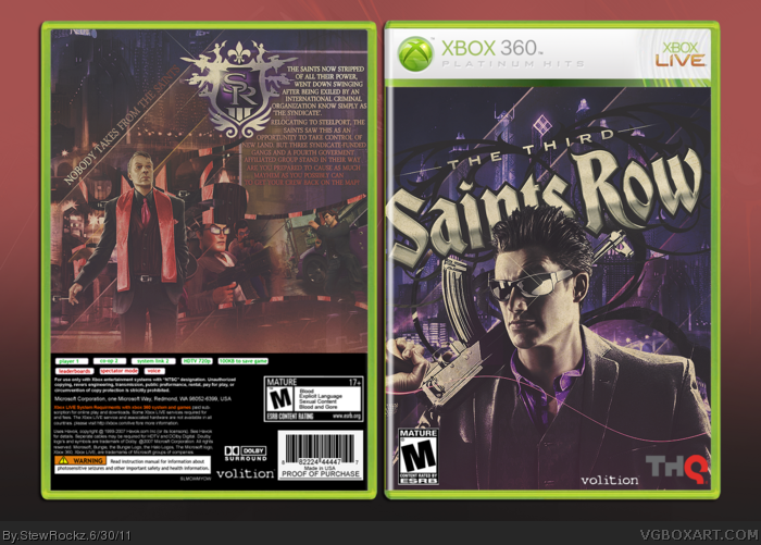
 Saints Row: The Third Box Cover Comments
hi! this is my first box. i don't really know the drill but I guess you guys just tell me some pros and cons. shoot.
[ Reply ]
Looks great, the colors look awesome. The backs layout is really interesting as well.
[ Reply ]
#2, thanks!
[ Reply ]
Your going to become a great box artist... This is great!
[ Reply ]
Really nice!
[ Reply ]
This is very nice for a first. I would probably increased the contrast a bit to make the cover more "sparkly" and made the tagline bigger in the back but other than that it looks really nice.
Can't wait to see more covers from you and welcome to the site!
[ Reply ]
It seems somewhat desaturated but none the less, it's great! :D
[ Reply ]
thanks for the comments guys, about it being desaturated, yeh I kinda always go overboard with the gradient maps and color fills lol.
[ Reply ]
I agree that it looks a bit desaturated but overall this is an excellent first!
[ Reply ]
#9, ty.
[ Reply ]
I like the look a whole lot - brilliant first effort. Looking forward to see what you have to show next.
[ Reply ]
#11, thank you. Also, thanks for the faves guys-much appreciated.
[ Reply ]
#7, I agree
[ Reply ]
This rocks.
[ Reply ]