This box is late becasue of my power is out and couldn't have uploaded it yesterday. Also this is okay with everyone and will be judged; hopefully. Thanks for everyones help and enjoy my second entry to The Theme of The Month.
I like it it's really good and should be used as an official. What i don't like is the game itself. (I miss Angelina Jolie....:() But it's really good. How long did this take you?
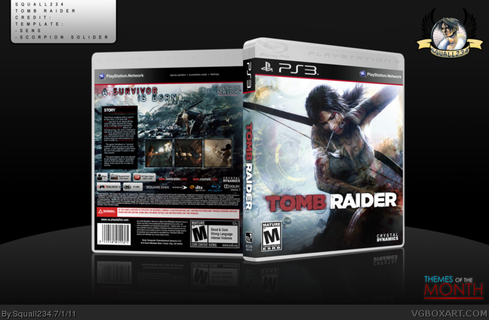
Great box, all around love every bit of it, although something about the tagline bothers me, I'm not sure if it's font, the glow or if the blue color should be white.
The front's very nice. The back reminds me of your Uncharted 2 cover, although a few things could be worked on. Something about the tagline looks off, the drop shadow perhaps. And I think the screens are too large.
 Tomb Raider Box Cover Comments
This box is late becasue of my power is out and couldn't have uploaded it yesterday. Also this is okay with everyone and will be judged; hopefully. Thanks for everyones help and enjoy my second entry to The Theme of The Month.
[ Reply ]
Love it. This should be used as official one.
[ Reply ]
#2, Thanks man!
[ Reply ]
I like it it's really good and should be used as an official. What i don't like is the game itself. (I miss Angelina Jolie....:() But it's really good. How long did this take you?
[ Reply ]
#4, At least 76 hours lol
Thanks man!
[ Reply ]
I really like what you have here. Well put together and it's something I could see on a shelf.
[ Reply ]
#6, Thanks =)
[ Reply ]
Great box, all around love every bit of it, although something about the tagline bothers me, I'm not sure if it's font, the glow or if the blue color should be white.
[ Reply ]
Beautiful. This game looks to be an Uncharted competitor.
[ Reply ]
it came out perfect
[ Reply ]
Looks good. Great job!
[ Reply ]
#8, Acutally, the tagline was the actual official tagline so I used it.
Thanks to all!
[ Reply ]
Really nice work overall - the entire box has a great feel to it.
[ Reply ]
#13, Thanks man!
[ Reply ]
Great work, but I liked the more saturated red on the front's logo better. I also dislike the tagline, you should've used a bolder font, IMO.
[ Reply ]
The front's very nice. The back reminds me of your Uncharted 2 cover, although a few things could be worked on. Something about the tagline looks off, the drop shadow perhaps. And I think the screens are too large.
[ Reply ]
#16, I have to agree man. Might have to redo the tagline.
[ Reply ]
this is still a very slick box!
the back especially, is very well done.
I only hope you remove or adjust the tagline.
Great work.
[ Reply ]