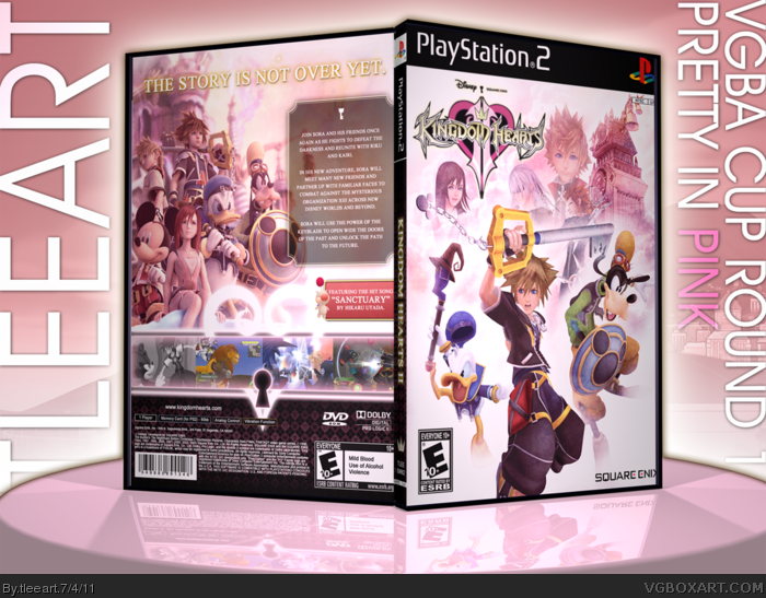
Here's my box for Round One of the VGBA Cup. Credits are all over the place, from Master General for the template, Apollo for the render of Axel, Creative Uncut, Kingdom Hearts Ultimania, and the Kingdom Hearts Wiki for many of the images. The front was somewhat inspired by Marker's Kingdom Hearts II box.
This is actually an edit of what I sent in, as I noticed there were some errors, which made it look like the game logo was cut off, which it's not on the printable.
Not exactly reinventing the wheel here, but I like the turnout.
#4, I appreciate your opinion and comment. However, I didn't feel it had to be hot pink all over to be "Pretty in Pink". It was a deliberate decision I made. I was also aware someone would question that.
I like how you've kept the pink as a prominent aspect of the color scheme, yet kept it from completely overpowering the other colors. It seems to fit Kingdom Hearts pretty well, and while I've no problems with the back, the seemingly random character placement on the front is what's bothering me.
#6, Thanks for commenting, first off. I didn't really see my composition as random when I did it. I wanted to do a movie poster-esque composition, with portraits of supporting cast in behind the main heroes.
I'm glad you didn't just come over and say "you did an awesome job!" and actually gave me something to think about.
More than anything, I'm just sick and tired of boxes like "OMG DANIEL RYCLIFFE IS UGLY" getting so much attention on this site, while my works, and the works of others, get categorically ignored.
Sorry for the rant everybody, but it needed to be said!
Please, keep your comments (on the box) rolling in!
#7, I know exactly how you feel, so I'm gonna do my part and give some thoughts on this box.
First off I really, really dislike your 3D template, and I think a better one would help the box to stand out more. As for the box itself, the back, while looking a bit empty, still works and looks rather nice. The front does too, however I don't like the characters that are faded out a little, also their placement is questionable, some better placement and better blending would definitely turn this box into something great in my opinion.
Also as for the color scheme, I think the white is more predominant than the pink is here, and it probably hurt your score with the judges, but it was a good effort.
I'll see what I can do in the future on the 3D. It's tough because I make the 3D in 3D Studio Max, but I may need to get imandix again for presentations.
You're the second one to say I was weak on the pink, so I'm guessing it is a likely issue for the judges as well. The front composition is now a glaring issue for me.
Thanks for the valuable input. It's good to know why people think this is lacking.
This needs more attention, so I'll be promoting it from now on. I think it looks fantastic, really - the pink is not too strong here, which is what I like, the muted colour really gives it character. Those screenborders are also amazing, by the way.
 Kingdom Hearts II Box Cover Comments
Here's my box for Round One of the VGBA Cup. Credits are all over the place, from Master General for the template, Apollo for the render of Axel, Creative Uncut, Kingdom Hearts Ultimania, and the Kingdom Hearts Wiki for many of the images. The front was somewhat inspired by Marker's Kingdom Hearts II box.
This is actually an edit of what I sent in, as I noticed there were some errors, which made it look like the game logo was cut off, which it's not on the printable.
Not exactly reinventing the wheel here, but I like the turnout.
[ Reply ]
Fantastic box, Tim. The pink, for some odd reason, suits the game. Great job, definitely worth the favourite I gave it.
[ Reply ]
#2, Thanks! I think it suits the game pretty well, also.
Edited at 1 decade ago
[ Reply ]
This isn't as pink as I think I expected from these boxes. The pink should have been even more prominent.
[ Reply ]
#4, I appreciate your opinion and comment. However, I didn't feel it had to be hot pink all over to be "Pretty in Pink". It was a deliberate decision I made. I was also aware someone would question that.
Thanks for stopping by and voicing your opinion.
[ Reply ]
I like how you've kept the pink as a prominent aspect of the color scheme, yet kept it from completely overpowering the other colors. It seems to fit Kingdom Hearts pretty well, and while I've no problems with the back, the seemingly random character placement on the front is what's bothering me.
[ Reply ]
#6, Thanks for commenting, first off. I didn't really see my composition as random when I did it. I wanted to do a movie poster-esque composition, with portraits of supporting cast in behind the main heroes.
I'm glad you didn't just come over and say "you did an awesome job!" and actually gave me something to think about.
More than anything, I'm just sick and tired of boxes like "OMG DANIEL RYCLIFFE IS UGLY" getting so much attention on this site, while my works, and the works of others, get categorically ignored.
Sorry for the rant everybody, but it needed to be said!
Please, keep your comments (on the box) rolling in!
[ Reply ]
#7, I know exactly how you feel, so I'm gonna do my part and give some thoughts on this box.
First off I really, really dislike your 3D template, and I think a better one would help the box to stand out more. As for the box itself, the back, while looking a bit empty, still works and looks rather nice. The front does too, however I don't like the characters that are faded out a little, also their placement is questionable, some better placement and better blending would definitely turn this box into something great in my opinion.
Also as for the color scheme, I think the white is more predominant than the pink is here, and it probably hurt your score with the judges, but it was a good effort.
[ Reply ]
I'll see what I can do in the future on the 3D. It's tough because I make the 3D in 3D Studio Max, but I may need to get imandix again for presentations.
You're the second one to say I was weak on the pink, so I'm guessing it is a likely issue for the judges as well. The front composition is now a glaring issue for me.
Thanks for the valuable input. It's good to know why people think this is lacking.
[ Reply ]
#7: I know what you mean. It's absurd to think that troll covers like that can still find their way back onto the front page.
[ Reply ]
This needs more attention, so I'll be promoting it from now on. I think it looks fantastic, really - the pink is not too strong here, which is what I like, the muted colour really gives it character. Those screenborders are also amazing, by the way.
[ Reply ]