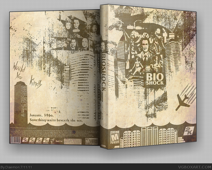
I am so sick of this concept being done to death, but god damn it this looks good! My only complaints are the PS3 logo, it's hard to read, and having "would you kindly" on the back is not a good decision in my opinion, but I suppose this is a box for people who already love the game.
Nice job putting a spin on an over used idea though, it's really nice.
It's weird how often people will design a cover that will take away some of the most powerful parts of the game by either spoiling them or referencing them. You can't just stick "Would you kindly" anywhere, out of context, and expect it to have any kind of relevance. You're pretty much telling players "Hey, keep an eye out for "Would you kindly." except by doing that, you're robbing the impact it has on the player because now the whole game players are going to be thinking "Oh yeah, there's that thing." every time it comes up.
I think it looks absolutely fantastic, but I also think you should ditch the quote. Although I feel it's worth noting that grunge design style and art deco doesn't mix very well.
This is going to be a stupid comment but the bottom has been done before with the waves which doesn't make sense because in the middle of the ocean the sea is usually flat unless it's storming. So if it wasn't waves but more curves I think it would look better.
#28, if somebody, by some odd chance, didn't know what Bioshock was about, they wouldn't understand the city was underwater if it was just flat. At least you can deduce that it is water by the stylized waves.
#28, It's clearly not supposed to be a realistic portrayal of any scenery. It's composed of symbols, and that choppy look is a universal symbol for water.
 BioShock Box Cover Comments
This came out of a dream I had. No joke. I have no idea if it's good or not.
I used only two colors. Full view, please. Thank you.
Enjoy.
EDIT: I credit my inspiration on the bottom half of the front to ColonCatastrophe, and in turn, Bernbaum of Neogaf.
Edited at 1 decade ago
[ Reply ]
I am glad you had that dream.
[ Reply ]
#2, Thank you.
[ Reply ]
I can credit dreams for close to 10 of my boxarts. It happens a lot.
Great work though. I love the simplicity of it all.
[ Reply ]
Amazing, simply amazing. This is rivals even some of the best boxes on this site. Congrats on having a dream made of gold.
[ Reply ]
#4, I appreciate it, man.
#5, Do you really mean that? One thousand times thank you.
[ Reply ]
GOD DAMN PRETTY!
Credit goes to BERNBAUM FROM NEOGAF :P
[ Reply ]
Really great work here!
[ Reply ]
I am so sick of this concept being done to death, but god damn it this looks good! My only complaints are the PS3 logo, it's hard to read, and having "would you kindly" on the back is not a good decision in my opinion, but I suppose this is a box for people who already love the game.
Nice job putting a spin on an over used idea though, it's really nice.
[ Reply ]
#9, Thank you, I'll update the PS3 logo tomorrow, that was the only part of the box I was unsure of.
[ Reply ]
That's one hell of a dream you had!
+ FAV
[ Reply ]
Not bad at all. I like it.
[ Reply ]
Really nice job, I love it.
[ Reply ]
Great work here, bud.
[ Reply ]
Breathtaking.
[ Reply ]
I think the city in the front's bottom should be smaller, I'd dare to say it's not that close to the surface.
[ Reply ]
Great improvement on a classic.
[ Reply ]
Just amazing, great job. it captures the old feel of the game very well. this is the kind of level of creativity i want to see more on VGBA.
[ Reply ]
One problem...
It's a PS3 box and I NEED this for my 360 version of the game. Truly epic man!
[ Reply ]
Thank you to everyone. This is pretty amazing feedback.
#19, I'll see what I can do about that.
[ Reply ]
Nice dude, this is very creative.
[ Reply ]
This puts my Bioshock WIP to shame. Good job!
[ Reply ]
It's weird how often people will design a cover that will take away some of the most powerful parts of the game by either spoiling them or referencing them. You can't just stick "Would you kindly" anywhere, out of context, and expect it to have any kind of relevance. You're pretty much telling players "Hey, keep an eye out for "Would you kindly." except by doing that, you're robbing the impact it has on the player because now the whole game players are going to be thinking "Oh yeah, there's that thing." every time it comes up.
I think it looks absolutely fantastic, but I also think you should ditch the quote. Although I feel it's worth noting that grunge design style and art deco doesn't mix very well.
[ Reply ]
This is very nice, I like the colours you used and the twist to the original design, very nice indeed.
[ Reply ]
Very nice, great work.
[ Reply ]
ROFL YOU DREAM ABOUT BOXARTS NERD NERD NERD
[ Reply ]
Thanks everyone for getting this into the HoF! It really means a lot to me.
[ Reply ]
This is going to be a stupid comment but the bottom has been done before with the waves which doesn't make sense because in the middle of the ocean the sea is usually flat unless it's storming. So if it wasn't waves but more curves I think it would look better.
[ Reply ]
#28, if somebody, by some odd chance, didn't know what Bioshock was about, they wouldn't understand the city was underwater if it was just flat. At least you can deduce that it is water by the stylized waves.
[ Reply ]
#28, It's clearly not supposed to be a realistic portrayal of any scenery. It's composed of symbols, and that choppy look is a universal symbol for water.
[ Reply ]
This is too good, +author fav!
[ Reply ]
Freaking sweet, Daemon.
[ Reply ]