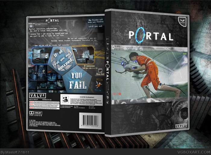
It's nice to see a different take on a Portal cover :-) I really love the front and side! The back seems a bit messy for me though. I think its the position of the text. But great job overall!
This looks good, I really like it, but it just doesn't fit with Portal's visual style. It's so grungy and dirty, and while some of Portal was spent in a dilapidated area, the game's style and themes suggest that a cleaner approach is more fitting.
Despite that, though, I still really like it. Where did you get that image on the front?
 Portal Box Cover Comments
One old box I never finished, is now ... finished
Kinda of an odd box indeed, but hey ... it's an odd game (but good)
[ Reply ]
Fantastic composition is displayed in this.
[ Reply ]
It's nice to see this one finally finished. Good job on the back.
[ Reply ]
It's nice to see a different take on a Portal cover :-) I really love the front and side! The back seems a bit messy for me though. I think its the position of the text. But great job overall!
[ Reply ]
I love the layout on the back, good job again!
[ Reply ]
Wow this looks awesome. The back especially shines.
[ Reply ]
This looks good, I really like it, but it just doesn't fit with Portal's visual style. It's so grungy and dirty, and while some of Portal was spent in a dilapidated area, the game's style and themes suggest that a cleaner approach is more fitting.
Despite that, though, I still really like it. Where did you get that image on the front?
[ Reply ]
Thanks =)
I wanted it to be grungy, The game turns on you & and you are faced with , I'm not really giving anything away though.
I found it a long time ago, I do believe it was a cos-player
[ Reply ]