Really nice. I was so disapointed in the cover for LA Noire, and this is honestly a whole lot better. I would have liked it if this was the official...
I don't have anything to critique on really, I guess I'll just leave this fav laying around.
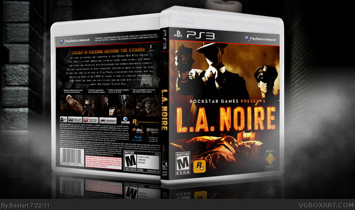
#2, There wasn't much color in the 40's ;) I just feeled to let it black & white/brown sepia to give that rustique and retro look.
the borders are actually the film strip, it isn't really noticable (is really dark with a small bevel outline) I could add a white border to give the screens a better look. Thanks for the comment, it's helpfull ;)
#3 Thanks for the fave, I'm glad you liked it :) I also didn't really like the official box, there's a lot better artwork of Cole Phelps.
I'm liking that front a lot. The back looks good, too...maybe a bit uninspired (and the text is a little choppy,) but there's nothing seriously wrong with it. Overall a very solid boxart, good work!
 L.A. Noire Box Cover Comments
I never was pleased with the front I had on this box, but when I found this picture link I got back to it and finished it.
It's pretty basic, but I really wanted to go for that old vintage film look.
Credits to 'Sens' for the Template
and to DieheArt for the straight grungy line brushes link
Edited at 1 decade ago
[ Reply ]
Front looks really nice and great image editing but the back lacks color and creativity. Screenshots could also use some kind of borders.
[ Reply ]
Really nice. I was so disapointed in the cover for LA Noire, and this is honestly a whole lot better. I would have liked it if this was the official...
I don't have anything to critique on really, I guess I'll just leave this fav laying around.
[ Reply ]
#2, There wasn't much color in the 40's ;) I just feeled to let it black & white/brown sepia to give that rustique and retro look.
the borders are actually the film strip, it isn't really noticable (is really dark with a small bevel outline) I could add a white border to give the screens a better look. Thanks for the comment, it's helpfull ;)
#3 Thanks for the fave, I'm glad you liked it :) I also didn't really like the official box, there's a lot better artwork of Cole Phelps.
[ Reply ]
I'll add some more color to the back and make the film strip brighter.
edit: I've updated the printable with the above mentioned changes. I hope the back looks better now?
Edited at 1 decade ago
[ Reply ]
I'm liking that front a lot. The back looks good, too...maybe a bit uninspired (and the text is a little choppy,) but there's nothing seriously wrong with it. Overall a very solid boxart, good work!
[ Reply ]
#6, Thanks, I was also very pleased how the front came out after I found the image.
It looks choppy on the render, but on the printable it's sharp and easy to read imo.
Edited at 1 decade ago
[ Reply ]