Not bad. I think the blue would look better if it was a bit lighter though, as it is right now the contrast between the blue and the white is really strong.
I really like this :-D The text on the back needs a little bit of fixing up so that it's readable but I really like the rest of it. The front is great!
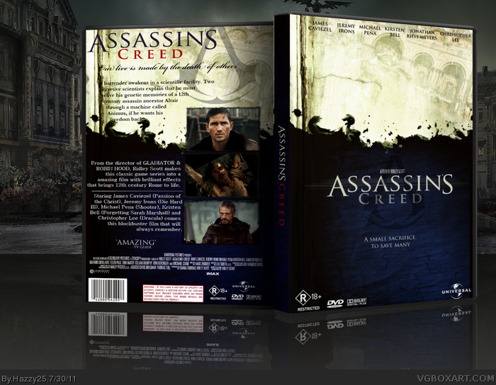
 Assassian's Creed Movie Box Cover Comments
Not bad. I think the blue would look better if it was a bit lighter though, as it is right now the contrast between the blue and the white is really strong.
[ Reply ]
could use a printable, plus, the backgrounds on the front and back are the same, but, other than that, looks professional!
[ Reply ]
Something about the blue splattered against the tatter paper is really appealing to me. The colors work well together.
[ Reply ]
#2, this.
[ Reply ]
It looks amazing. The blue looks good, but I'd like to see a red version.
[ Reply ]
#4, yes... this... whatever that means...
[ Reply ]
Thanks for the comments a red version is in the WiP here.
link
[ Reply ]
I really like this :-D The text on the back needs a little bit of fixing up so that it's readable but I really like the rest of it. The front is great!
[ Reply ]
will you make a printable though?
[ Reply ]
Can't believe this didn't get more attention. Looks amazing!
[ Reply ]
Wow, this is awesome indeed!
[ Reply ]