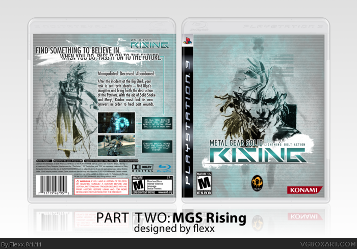
#2, Well, the header (as well as the summary text, because I don't know wtf this game is actually gonna be about) was inspired by my buddy dms' Rising box (just changed a few words.) For those of you awesome people who have played MGS2, the tagline should look familiar :D
And yeah, I tried my best to make Shinkawa's Raiden artwork for MGS4 fit this style...hopefully he'll make some more art as the game approaches.
#3, "For those of you awesome people who have played MGS2, the tagline should look familiar :D"
I played MGS2, but it sucked compared to MGS1 and all the others.
so, the tagline have slipped my mind, never really got in this game to much. MGS3 however,
was really awesome and the follow-up even better (except for some of those everlasting lousy cutscenes)
I like the faint blue color scheme. It's a nice contrast to your MGS4 cover, and works really well with the rough texturing. Shinkawa's artwork looks stunning as well, and I believe this is one of your best yet. Nice little addition of the artificial blood behind the logo and tagline.
A little blurry in full view, but overall it looks great.
Me likey the color scheme, ditto to some of the users have said here, especially the gradient filter on the logo, 'tis a very nice touch.
Back's pretty well organized, though the artwork is kinda blurry when viewed in full view, but I get the sense of what you're trying to nail in terms of presentation.
 Metal Gear Solid Rising Box Cover Comments
Fin.
[ Reply ]
To bad there isn't artwork for the evolved Raiden in MGS Rising :(
I love the back; simple (but effective), eye-catchy and a very clever header.
Do you got some inspiration of Crysis 2 'Adapt. Upgrade. Dominate'
by using, the words 'Manipulated. Decieved. Abandoned.?
or do they use the lines often? I really like it, though.
I'll fave this for sure ;) Could you upload a printable?
Edited at 1 decade ago
[ Reply ]
#2, Well, the header (as well as the summary text, because I don't know wtf this game is actually gonna be about) was inspired by my buddy dms' Rising box (just changed a few words.) For those of you awesome people who have played MGS2, the tagline should look familiar :D
And yeah, I tried my best to make Shinkawa's Raiden artwork for MGS4 fit this style...hopefully he'll make some more art as the game approaches.
[ Reply ]
Good but I think that Raiden should be moved to the left a little on the back.
[ Reply ]
#3, "For those of you awesome people who have played MGS2, the tagline should look familiar :D"
I played MGS2, but it sucked compared to MGS1 and all the others.
so, the tagline have slipped my mind, never really got in this game to much. MGS3 however,
was really awesome and the follow-up even better (except for some of those everlasting lousy cutscenes)
Edited at 1 decade ago
[ Reply ]
Thank you to the...two...people who commented :)
Edited at 1 decade ago
[ Reply ]
Simply amazing work. I Really enjoy what you have done here. Great job.
[ Reply ]
I like the faint blue color scheme. It's a nice contrast to your MGS4 cover, and works really well with the rough texturing. Shinkawa's artwork looks stunning as well, and I believe this is one of your best yet. Nice little addition of the artificial blood behind the logo and tagline.
A little blurry in full view, but overall it looks great.
[ Reply ]
Oh hell yes, this is so much better than the first version
[ Reply ]
I also like the colour scheme and the way you used the artwork is amazing.
[ Reply ]
Me likey the color scheme, ditto to some of the users have said here, especially the gradient filter on the logo, 'tis a very nice touch.
Back's pretty well organized, though the artwork is kinda blurry when viewed in full view, but I get the sense of what you're trying to nail in terms of presentation.
You have my approval.
Also don't kick me in the crotch.
Edited at 1 decade ago
[ Reply ]
Metal Gear Bump...lol
[ Reply ]
Why did i miss this one? o.O looks amazing!
[ Reply ]