[ Buy Deus Ex: Hum... at Amazon ] By Throavium. 26 on August 27th, 2011 Download Printable Deus Ex: Human Revolution Box Cover Comments Comment on Throavium.'s Deus Ex: Human Revolution Box Art / Cover. Cancel Reply Daemon 46 [ 1 decade ago ] Your back designs never fail to impress. [ Reply ] Taylor360unc 1 [ 1 decade ago ] Epic [ Reply ] twoxT 34 [ 1 decade ago ] #1, this. [ Reply ] Sp-6 40 [ 1 decade ago ] great job. btw its a stupid question, but what does [h+]^3 mean?:) [ Reply ] Throavium. 26 [ 1 decade ago ] #4, I have no idea what it means, I just know that it's a common recurring symbol throughout the game and artwork. [ Reply ] Bastart 49 [ 1 decade ago ] Great Game, Excellent Box! [ Reply ] Throavium. 26 [ 1 decade ago ] Thanks [ Reply ] deiviuxs 46 [ 1 decade ago ] Very nice, Thro. The layout on the back is superb, but again, the typography is very similar. You need to experiment with some new fonts and ideas for typography. Front looks awesome, logo is hard to see a bit though. [ Reply ] Throavium. 26 [ 1 decade ago ] #8, Like what? [ Reply ] amad2 30 [ 1 decade ago ] Beautiful. Sorry I cant give more critique, I cant see anything wrong. [ Reply ] Throavium. 26 [ 1 decade ago ] #10, No problems. [ Reply ] Bastart 49 [ 1 decade ago ] #4, I found something that will explain it a bit link basically it's post-human to the power of 3 or third tier/order link (last comment) by the way, this needs HOF.... Edited at 1 decade ago [ Reply ] mitsui 1 [ 1 decade ago ] i love the layout on the back.. where did you get that render of Adam Jensen? [ Reply ] Abrao 34 [ 1 decade ago ] Check on Google. I found it here an example: link [ Reply ] mitsui 1 [ 1 decade ago ] oops i guess my question wasn't clear enough.. the render from the back. [ Reply ]
 Deus Ex: Human Revolution Box Cover Comments
Your back designs never fail to impress.
[ Reply ]
Epic
[ Reply ]
#1, this.
[ Reply ]
great job. btw its a stupid question, but what does [h+]^3 mean?:)
[ Reply ]
#4, I have no idea what it means, I just know that it's a common recurring symbol throughout the game and artwork.
[ Reply ]
Great Game, Excellent Box!
[ Reply ]
Thanks
[ Reply ]
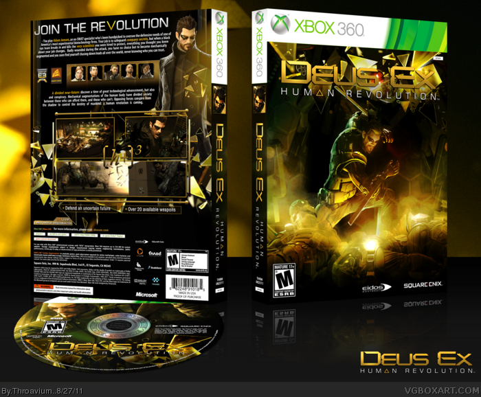
Very nice, Thro. The layout on the back is superb, but again, the typography is very similar. You need to experiment with some new fonts and ideas for typography. Front looks awesome, logo is hard to see a bit though.
[ Reply ]
#8, Like what?
[ Reply ]
Beautiful. Sorry I cant give more critique, I cant see anything wrong.
[ Reply ]
#10, No problems.
[ Reply ]
#4, I found something that will explain it a bit link
basically it's post-human to the power of 3 or third tier/order link (last comment)
by the way, this needs HOF....
Edited at 1 decade ago
[ Reply ]
i love the layout on the back.. where did you get that render of Adam Jensen?
[ Reply ]
Check on Google. I found it here an example: link
[ Reply ]
oops i guess my question wasn't clear enough.. the render from the back.
[ Reply ]