I've made the box render with Imandix because, I suck at skewing :(
and Imandix let you make a box from 2000 x 2000 pixels, but when
I load it in Photoshop and resize it, it becomes very lo-res?
especially the back? it becomes unreadable as many of you already said.
I will upload a printable and than you can see the difference, I hope?
again, I'm really sorry for the bad quality of the render, I've also noticed it myself :(
Very nice. Like what you did with the front and to see all the pieces coming together. Back is nice too but I don't think blended screenshots fit this type of game very well.
The image quality deteriorates to such a large degree in your traditionally presented submissions, but it's a good choice adding a printable along with it.
There are a few inconsistencies on the front. Most notably, that police stop sign looks pretty obviously pasted in, due to jagged, dark outer edges that don't match up with the surrounding image. Other smaller examples would be the generally aliased look of the cars (especially the patrol car) and some off lighting on the lead car (most obvious around the right mirror).
The back does better to avoid these issues. The cars appear much cleaner, more vibrant and generally fit in very well with the environment. You say you arranged the front yourself, did you do so with the back as well? It's nice.
Its a shame that its a bit low res, but i still like it. One way to keep the resolution high is to make sure all your working documents are 300dpi in pixel per inch value, that way you're keeping the resolution consistent and it should help a bit.
Either way, fav for an excellent arrangement. And Hot Pursuit is my favorite NFS game!!
Good job, I'm glad I was able to inspire you! This is great.
Unfortunately, I'm done boxarting. it's been a great 4 year run and I've loved every bit of it, but I can't do this anymore. The site is dying, I have to face it.
#15, I think it is because I use mainly masking to blend the pictures together? that's why some bits of the other images are still visible and some parts are at low opacity and no, I didn't create the image on the back (It was a very high res screenshot, 2560 x 1440, of the game)
#16 Thanks ;) It's almost impossible to find any screenshots/artwork that are in full 300dpi :) most of the time you have to resize the image to make it 300dpi, but I see what you mean by it, thanks anyway.
#17 So sad to see some great box artists leaving :( First I Leegion was going to say goodbey and now it's you.
Well, I hope you come back one time? and I wish you the best ;)
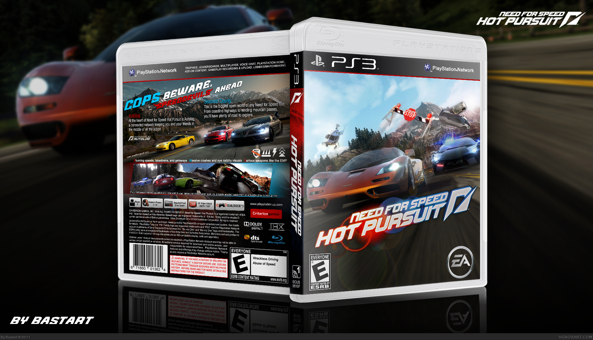
I made an update, once again.
Brightened the front, re-aranged the pictures and made the McClaren much more orange than it was before.
I also figured out why the render was of such low quality, I've made the render in a 300dpi document instead of 72dpi :/
Still the jagged lines remain :( but it should be much better now. The printable is still the best ;)
 Need for Speed Hot Pursuit Box Cover Comments
You get better with every box.
[ Reply ]
^agreed. this is excellent.
[ Reply ]
#1, Agreed. But the text on the back is very blurry.
[ Reply ]
I like this box, but for some reason it's incredibly low-def.
+fave anyway.
[ Reply ]
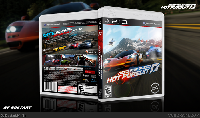
I always wanted to make a Need for Speed box, so here it is.
I was a bit inspired by Hatty's 360 box link
The front is made with 5 different screenshots/wallpapers of the game:
Race Car link
Cop Car link
Helicopter link
Stop sign link
Mountains background link
Credits to Scorpion Soldier and Sens for the templates.
Edited at 1 decade ago
[ Reply ]
I've made the box render with Imandix because, I suck at skewing :(
and Imandix let you make a box from 2000 x 2000 pixels, but when
I load it in Photoshop and resize it, it becomes very lo-res?
especially the back? it becomes unreadable as many of you already said.
I will upload a printable and than you can see the difference, I hope?
again, I'm really sorry for the bad quality of the render, I've also noticed it myself :(
Edited at 1 decade ago
[ Reply ]
I've tried to update the render, it's a bit better, I hope?
but the printable version is still the best quality.
[ Reply ]
I actually totally forgot to give credits to Spiderpig24, Who has made the NFS: Hot Pursuit logo.
[ Reply ]
I've been waiting for that one box that would really skyrocket your box art creator status and this is the one :)
[ Reply ]
#9, Thank you very much, appreciate the feedback ;)
[ Reply ]
You're steadily growing into a real force to be reckoned with.
[ Reply ]
#11, Thanks, I think I did pretty good, I guess?
but competing with the top, idk :/
[ Reply ]
Very nice. Like what you did with the front and to see all the pieces coming together. Back is nice too but I don't think blended screenshots fit this type of game very well.
[ Reply ]
#13, Thanks ;) I'm going to update it by removing the blending from the screenshots,
and some little adjustments to the front and the back.
Again thanks for the advice.
Edited at 1 decade ago
[ Reply ]
The image quality deteriorates to such a large degree in your traditionally presented submissions, but it's a good choice adding a printable along with it.
There are a few inconsistencies on the front. Most notably, that police stop sign looks pretty obviously pasted in, due to jagged, dark outer edges that don't match up with the surrounding image. Other smaller examples would be the generally aliased look of the cars (especially the patrol car) and some off lighting on the lead car (most obvious around the right mirror).
The back does better to avoid these issues. The cars appear much cleaner, more vibrant and generally fit in very well with the environment. You say you arranged the front yourself, did you do so with the back as well? It's nice.
[ Reply ]
Its a shame that its a bit low res, but i still like it. One way to keep the resolution high is to make sure all your working documents are 300dpi in pixel per inch value, that way you're keeping the resolution consistent and it should help a bit.
Either way, fav for an excellent arrangement. And Hot Pursuit is my favorite NFS game!!
[ Reply ]
Good job, I'm glad I was able to inspire you! This is great.
Unfortunately, I'm done boxarting. it's been a great 4 year run and I've loved every bit of it, but I can't do this anymore. The site is dying, I have to face it.
Thanks everybody, and goodbye!
[ Reply ]
#15, I think it is because I use mainly masking to blend the pictures together? that's why some bits of the other images are still visible and some parts are at low opacity and no, I didn't create the image on the back (It was a very high res screenshot, 2560 x 1440, of the game)
#16 Thanks ;) It's almost impossible to find any screenshots/artwork that are in full 300dpi :) most of the time you have to resize the image to make it 300dpi, but I see what you mean by it, thanks anyway.
#17 So sad to see some great box artists leaving :( First I Leegion was going to say goodbey and now it's you.
Well, I hope you come back one time? and I wish you the best ;)
I made an update, once again.
Brightened the front, re-aranged the pictures and made the McClaren much more orange than it was before.
I also figured out why the render was of such low quality, I've made the render in a 300dpi document instead of 72dpi :/
Still the jagged lines remain :( but it should be much better now. The printable is still the best ;)
Edited at 1 decade ago
[ Reply ]