![]() »
»
[ Box updated on September 5th, 2011 ] [ original ]
 Deus Ex: Human Revolution Box Cover Comments
Comment on Ronthis the Werewolf's Deus Ex: Human Revolution Box Art / Cover.
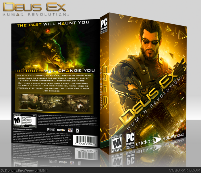
So, after making this box 3 times (Gimp kept crashing) I finally managed to get it done, and I must say, I am quite pleased with it. I guess I kinda got the inspiration from Backin5minutes' box. Credit to him.
Anyway, Tell me what you think. Comments and Favorites are appreciated :)
Edited at 1 decade ago
[ Reply ]
I like it. The front is very, very similar to Backin5minutes' box, but I think it's different enough to hold it's own. I like the tilted logo and the cut off of what looks to be Hengsha, and it all blends together really well. It looks like the separation is coming from the blade on Jensen's arm, and i think that's really creative.
The back is good, but I think it's lacking in comparison to the front. The description feels a bit weak, and doesn't really get me excited to play the game. I like the way you did the screenshots, and the artwork near the top looks good, but also feels a bit empty. I think the tagline could be positioned better to help fill it up a little.
Overall I like it, but the front is much better than the front.
[ Reply ]
Love the design, It's amazing! The only thing i dont like is that the back is kind of space-y FAV'd!
[ Reply ]
Love the front, the inclinated scheme looks excellent, works outstandingly well.
The back, however (I think), is way too simple for a game like this, and I think that, even being harder to make, a more complex and detailed layout would suit it better, instead of having that classic layout you went with. Also, try putting the legal info and the requirements ona sngle text block (Move the ESRB to the right and make it a bit smaller), so it looks less text-heavy.
Overall, I don't like the back, as it could use work, but kudos for the front, that I find amazing.
[ Reply ]
I like the slanted layout beneath Adam, and how his blade separates himself from the city skyline. A much cleaner, more subtle way to blend the two images together. I feel Slimd is correct on the back though, it leaves a good deal to be desired.
[ Reply ]
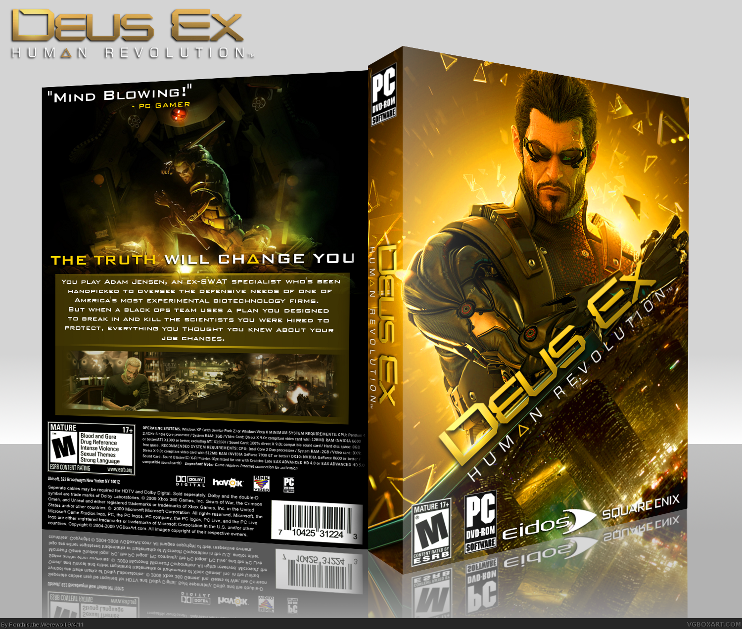
UPDATE: Replaced the quote on the back with another part of the tagline, and I touched up the colors to make it feel more vibrant. Plus I added a C4D to the image on the back so it makes more of a "Boom".
[ Reply ]
#2 "but the front is much better than the front."
I agree, lol. Like how the blade is in an angle with the title on top with the city skyline beneath it.
I know it's done before, but not in this way, I think?. The back need some small adjustments,
but it's really hard to get noticed with all those other great Deus Ex: HR boxes flowing around.
Edited at 1 decade ago
[ Reply ]
I have learned that it is impossible to make a bad Dues Ex box art unless you try to make it bad on purpose :)
[ Reply ]
Nice! I really like this.
[ Reply ]
#8, this. ;)
This may as well be your best box.
[ Reply ]
Shiny!
[ Reply ]
Thanks everyone for the faves, it means a lot. :)
EDIT: Oh yeah, added a printable for all of you ;D
Edited at 1 decade ago
[ Reply ]
I love that tagline.
[ Reply ]
#13 Thanks, I saw it in the trailer, so I fit them in xD
[ Reply ]
This is Very Nice, And Clean. I LIKE IT. ;D +Fav
[ Reply ]
I'm not too fond of the back. It's a really nice setup and I like the front, I just guess I think it's boring? It's still very well done!
[ Reply ]
That's wonderful, and so shiny...
Perfect job!
[ Reply ]
How you made the front is amazing. The way you separate the character and the city with the blade and the logo, that's pretty smart.
[ Reply ]
This junk will never make hof.
[ Reply ]
Should be close to a HoF though with 37 favs I guess.. but tbh I have no clue on how the hof works. Imho it should be in there.
[ Reply ]
@Rarity all ronthis' stuff is junk.
[ Reply ]
It seems like 41 favorites is the HoF trigger. SPREAD THE WORD YO
[ Reply ]
@Ronthis the Werewolf every1 go lyke ma bocks #2008VGBA
[ Reply ]
+fav
[ Reply ]
<3
[ Reply ]
Got you in the hall. You owe me.
[ Reply ]
Wait for it...
[ Reply ]
Gave my fav. Let's see if the magic happens
[ Reply ]
Oh wait forgot to fave
[ Reply ]
You think this is a mother fucking game?
[ Reply ]
Added this to HoF thread.
Just saying.
[ Reply ]
<3
[ Reply ]
AAAAAAAAAAAAAAAAAAAAAAAND HoF
[ Reply ]
Gz on HoF.. (i bet you screamed finally really hard and really long didn't ya?)
[ Reply ]
Sweet, my fav got it in :)
[ Reply ]
Realy great work...
[ Reply ]
Congrats you nerd lallolol
[ Reply ]
Thanks for the HoF, you guys :D
[ Reply ]
After you begged for it to be a HoF, yeah
[ Reply ]
@Higashi89 I didn't 'beg', I was making fun of what most people do by going "Please favorite my box, I want attention." HoF is just kinda cool for me.
[ Reply ]