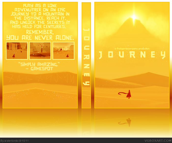
Really nice, minimalistic cover. Hall of fame is really hard to get these days with less members; I don't want to upset you but I doubt it'll get in. Great box though, probably the best I've seen from you.
Very impressive one, I love the front especially. However, on the back, the description text is too big and too long. In my opinion, it should reflects the essence of the game: short and mysterious description, discreet.
I want to like this, but the text on the back is a turn off. It quite simply goes against the very minimalism theme that you were striving for in the first place. Too large, and possibly even too much. I'd also argue that a GameSpot rating shouldn't appear on a minimalistic design.
Very nice, though I wish you had made the back's text smaller. I'm not too fond of the hierogliphs either.
I'd suggest that from now on you start to experiment with different back layouts, instead of just centering text and putting the screenshots bellow it.
 Journey Box Cover Comments
Well, Here it Is. My Journey Box, and Possible Attempt at HoF :P Thanks to all the People in The WiP , Especially Manuel ;)
I Have Worked VERY Hard on This Box, so PLLLEEEAAASSSEE Tell me What You Think ! :D
[ Reply ]
Really nice, minimalistic cover. Hall of fame is really hard to get these days with less members; I don't want to upset you but I doubt it'll get in. Great box though, probably the best I've seen from you.
Edited at 1 decade ago
[ Reply ]
#2, Thanks! And I know, A Boy can Dream Though. ;)
[ Reply ]
Anybody ... ?
[ Reply ]
At first I didn't like the font on the back...but I do now ;P fav!
[ Reply ]
#5, Loll Thanks ! :D
[ Reply ]
Really nice man, as I told you in the forums.
[ Reply ]
I really like it, I could see this going HoF. Just be patient.. Don't seem so eager.
The one thing I don't like is the size of the back text..
I'd rather like to the size go...
link
(: Try that. Maybe smaller?..
[ Reply ]
Love this, and HoF can take a from a few days to a few months bro :P
[ Reply ]
#9, Yeahh I Figured That. :P
P.S: I am Now RANK 5 !!! :D
Edited at 1 decade ago
[ Reply ]
Very simple, yet so effective for this type of game. really catches the atmosphere of a journey into nowhere land...
I only doubt there will be two Journey boxes featuring in the hall, unless hesit8 turns his box into MasterWorks?
You'll never know though. Good luck with it ;)
Edited at 1 decade ago
[ Reply ]
#11, Thanks :D
[ Reply ]
Wonderful, I really like how the mountain shines on the front. Excellent work.
[ Reply ]
Nice!
[ Reply ]
Wow! You just got way better at boxart making! :)
[ Reply ]
Very impressive one, I love the front especially. However, on the back, the description text is too big and too long. In my opinion, it should reflects the essence of the game: short and mysterious description, discreet.
[ Reply ]
I want to like this, but the text on the back is a turn off. It quite simply goes against the very minimalism theme that you were striving for in the first place. Too large, and possibly even too much. I'd also argue that a GameSpot rating shouldn't appear on a minimalistic design.
Edited at 1 decade ago
[ Reply ]
#16/17, Thanks for Your Honest Critiques :)
[ Reply ]
Great job waterlordo!
[ Reply ]
#19, Thanks! :D
[ Reply ]
Very nice, though I wish you had made the back's text smaller. I'm not too fond of the hierogliphs either.
I'd suggest that from now on you start to experiment with different back layouts, instead of just centering text and putting the screenshots bellow it.
Nice job, nevertheless.
[ Reply ]
#21, Agreed.
May be all screenshots should be removed, and put these text in center, and remove GameSpot rating as Sd said too. Just an idea though.
Edited at 1 decade ago
[ Reply ]
#21, I Will Experiment with it xD But I already DID "expirement" with my new WiP :P (NOT ADVERTISING, USING AN EXAMPLE)
[ Reply ]
#23, as long as you don't advertise Gucci shit, it's fine by me :P
[ Reply ]
#24, LOL.
[ Reply ]
Damn this is really nice.
[ Reply ]
#26, Thanks :P
[ Reply ]
Thanks for The Fav's Everyone ! ;D
[ Reply ]