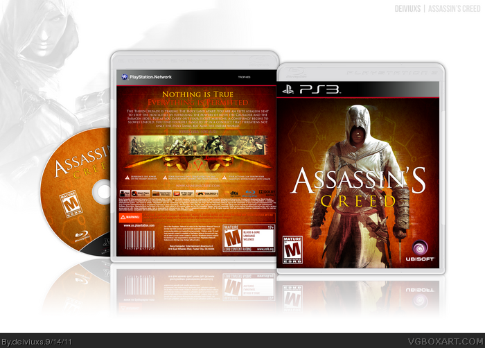
Yeah..so Assassin's Creed. I wanted to take a different approach on the game. Breaking free from the usual blue color themed boxes and going with a different color scheme. Tried going for something different..hopefully it turned out ok.
Been working quite a while on this, so I would appreciate any comments (good or bad).
Oh, and thanks to qwerty334 for some tips and advice.
#1, different, different and once again different.
serious, I quite like it :) although I still how dull it may sound the white/blue color scheme :/ but you've tried something else, to put it in a new direction which I truly encourage ;) I only think the line 'Everything is permitted' should be another color (white, maybe black?) because it's blending a bit to much now with the background.
I really like what you did with the back, great job.
Assassins creed in Gold. I have to say you've got guts. And its nice too. I never would have thoughr of AC in anything besides the ususal Black, Blue, Red, or White, or even (ugh) green. Excellent work.
I'd say keep the original ESRBs and remove the coloring on the Ubisoft logo. The red text on the back (Tagline, warning) is hard to read. I would also like to add that theblue Blu-Ray logo clashes with the color scheme, on which you did a great job.
Keeps to a number of Assassin's Creed staples, but the warm, golden color scheme does enough to set it apart. I've little else to mention, other than that it's simply pleasant to look at.
Thanks for the comments everyone. I really appreciate your feedback. As far as the tagline color goes, I know it might be a bit hard to see but the red fit the best to the color scheme I was going for, other colors I tried did not look good. Oh, and for the printable, I see what I can do.. :)
This is really impressive. I cant fave it cuz i did already, and i cant author fave you because i did already. :) Where did you find the chemical equations behind Altair? Whatever you did, this box is very attractive!
Though this is the first time ive seen an upside down assassins symbol.
I presume the chemical equations and structures are brushes. You can find them on the web. Google "animus brushes" and you will find plenty like this link or this link
It's definitely one of the better, more unique boxes I've seen in a while. I do think that the ESRB's would have looked better in their normal colors, and the red legal text on the back is a little difficult to read, but this is amazing.
Over all I like what you did, the color scheme you went for is unique, and I think you pulled it off well! Like others said, I think it would look more professional if the ESRB logos were their original black, but that's an aesthetic choice and I can respect you for that. Also I thought the red font you used on the back was well placed and clearly legible.
But I did spot one spelling error on the back:
[your existence will "chape" events in this pivotal moment during the third crusade]
I think you meant "shape" or "change"
 Assassin's Creed Box Cover Comments
Yeah..so Assassin's Creed. I wanted to take a different approach on the game. Breaking free from the usual blue color themed boxes and going with a different color scheme. Tried going for something different..hopefully it turned out ok.
Been working quite a while on this, so I would appreciate any comments (good or bad).
Oh, and thanks to qwerty334 for some tips and advice.
Enjoy! :)
Edited at 1 decade ago
[ Reply ]
I quite like this.. :D
The front has an especially nice, grainy, umm.. something, to it.
Faved.
[ Reply ]
The orange color scheme is new but it fits!
[ Reply ]
#1, different, different and once again different.
serious, I quite like it :) although I still how dull it may sound the white/blue color scheme :/ but you've tried something else, to put it in a new direction which I truly encourage ;) I only think the line 'Everything is permitted' should be another color (white, maybe black?) because it's blending a bit to much now with the background.
I really like what you did with the back, great job.
Edited at 1 decade ago
[ Reply ]
Splendid choice of colors. Love the back's simplicity.
[ Reply ]
Assassins creed in Gold. I have to say you've got guts. And its nice too. I never would have thoughr of AC in anything besides the ususal Black, Blue, Red, or White, or even (ugh) green. Excellent work.
[ Reply ]
Finally, someone who strayed from the usual color scheme, and made it look awesome. Great work!
[ Reply ]
I'd say keep the original ESRBs and remove the coloring on the Ubisoft logo. The red text on the back (Tagline, warning) is hard to read. I would also like to add that theblue Blu-Ray logo clashes with the color scheme, on which you did a great job.
[ Reply ]
I would kill a man for a printable.
[ Reply ]
#9 yep, we demand it!
[ Reply ]
It's awesome! Love it!
[ Reply ]
Awesome :D
[ Reply ]
Keeps to a number of Assassin's Creed staples, but the warm, golden color scheme does enough to set it apart. I've little else to mention, other than that it's simply pleasant to look at.
[ Reply ]
Thanks for the comments everyone. I really appreciate your feedback. As far as the tagline color goes, I know it might be a bit hard to see but the red fit the best to the color scheme I was going for, other colors I tried did not look good. Oh, and for the printable, I see what I can do.. :)
[ Reply ]
cool
Edited at 1 decade ago
[ Reply ]
I think I will put box arting on a hold for a while..
[ Reply ]
#16, PRINTABLE, DAMMIT!
[ Reply ]
Impressive, what else to say?
[ Reply ]
Good to see something new in an AC box. Nice work!
[ Reply ]
love a printable (maybe xbox printable too :)
[ Reply ]
This is very fresh and new for this series, something that is hard to do. I love the colour scheme, and it looks really professional!
[ Reply ]
Printable added.
[ Reply ]
I really, really like this. I wanted to do a unique Assassin's Creed box but I couldn't think of anything, so I'm glad you made this.
[ Reply ]
#23, Thanks. I would like to see what you can come up for this game design-wise.
[ Reply ]
Nice Job on this one
[ Reply ]
#25, Thanks.
[ Reply ]
Bump'd
[ Reply ]
I really like it its pretty unique
[ Reply ]
#27-28, Appreciate your comments!
[ Reply ]
Very nice
[ Reply ]
#30, Thanks. Glad you like it.
[ Reply ]
Fantastic job, deiviuxs
Edited at 1 decade ago
[ Reply ]
Bluuuurrrmmmp.
[ Reply ]
#32-33, Thank you both.
[ Reply ]
I like the color scheme, and the back is well designed. The banner of screenshots is really interesting. In one word, Fantastic.
Edited at 1 decade ago
[ Reply ]
#35, Thanks, glad you liked the screenshots. Took a lot of experimenting to come up with the look for them.
[ Reply ]
I like the set up of the back and the background on the front, and the color scheme seems to be spread well throughout.
[ Reply ]
#37, Thanks. The background on the front is almost the same as on the back though. :)
[ Reply ]
I like your use of textures! Good job!
[ Reply ]
#39, Thanks, Rex!
[ Reply ]
Bumped for biscuits.
[ Reply ]
#41, I like biscuits. =)
[ Reply ]
Very nice man.
[ Reply ]
Damn it, I already left a comment. But hey, still impressive.
[ Reply ]
This is really impressive. I cant fave it cuz i did already, and i cant author fave you because i did already. :) Where did you find the chemical equations behind Altair? Whatever you did, this box is very attractive!
Though this is the first time ive seen an upside down assassins symbol.
Edited at 1 decade ago
[ Reply ]
I presume the chemical equations and structures are brushes. You can find them on the web. Google "animus brushes" and you will find plenty like this link or this link
[ Reply ]
#45, I found the "chemical equation" in the Forums.
[ Reply ]
Very well done, nice job!
Edited at 1 decade ago
[ Reply ]
.....how is this not in HoF yet....this is awesome!
[ Reply ]
It's definitely one of the better, more unique boxes I've seen in a while. I do think that the ESRB's would have looked better in their normal colors, and the red legal text on the back is a little difficult to read, but this is amazing.
[ Reply ]
Over all I like what you did, the color scheme you went for is unique, and I think you pulled it off well! Like others said, I think it would look more professional if the ESRB logos were their original black, but that's an aesthetic choice and I can respect you for that. Also I thought the red font you used on the back was well placed and clearly legible.
But I did spot one spelling error on the back:
[your existence will "chape" events in this pivotal moment during the third crusade]
I think you meant "shape" or "change"
All-in-all great box!
Edited at 1 decade ago
[ Reply ]
I hate you.
In a good way ;)
[ Reply ]
Good cover, but not awesome because back is very simple. Only bacground and screens. This cover is not for master works for my opinion.
Edited at 1 decade ago
[ Reply ]
Oh, wow..this was a nice little surprise after a long day at work.
Thanks again for all those who left a comment and Favorited the box.
#51, you have a great idea for details. I might fix the spelling error if I end up updating the box.
#53, The back took much more effort to make than just putting screens on the background but thanks for your honest opinion.
[ Reply ]
This deserved the Hall, great job.
[ Reply ]
I love how different this is from all the other designs. Good idea, to step away from the usual Blue theme of AC.
[ Reply ]