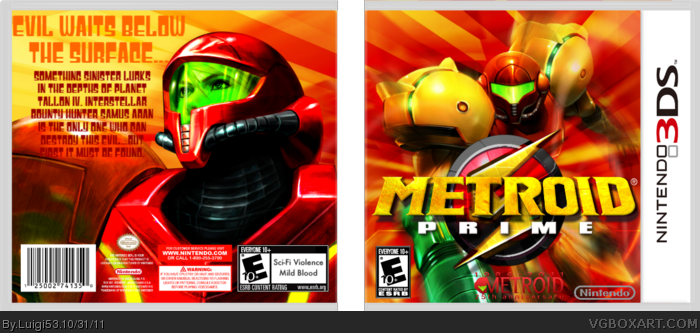
The front is pretty nice. The dev logos need to stand out more though, so try putting a hard drop shadow on them with a really short distance. That will make them pop more. I really think you could do better on the back. The font for the tagline and description is extremely unfitting, and certainly isn't readable enough for a synopsis font. You may want to find a way to incorporate some screenshots as well
First and foremost, the low resolution and choppy image quality (specifically the template and logos) is what I see first when viewing in full.
The front's not bad, but a texture-less logo would better fit with its surroundings. Other than that, the logos are hard to read as #2 said. The Nintendo logo should be white anyway, which would fix the visibility problem.
As for the back, the retro 70's font style doesn't exactly compliment the Metroid series, and is difficult to read against the similarly colored background. I'm also obligated to tell you that the image of Samus on the back is from Metroid: Other M.
 Metroid: Prime Box Cover Comments
Oops, I accidentally deleted it O_O. Well anyways, I think it turned out pretty well, what do you think? Also, Happy Halloween!
Edited at 1 decade ago
[ Reply ]
The front is pretty nice. The dev logos need to stand out more though, so try putting a hard drop shadow on them with a really short distance. That will make them pop more. I really think you could do better on the back. The font for the tagline and description is extremely unfitting, and certainly isn't readable enough for a synopsis font. You may want to find a way to incorporate some screenshots as well
[ Reply ]
First and foremost, the low resolution and choppy image quality (specifically the template and logos) is what I see first when viewing in full.
The front's not bad, but a texture-less logo would better fit with its surroundings. Other than that, the logos are hard to read as #2 said. The Nintendo logo should be white anyway, which would fix the visibility problem.
As for the back, the retro 70's font style doesn't exactly compliment the Metroid series, and is difficult to read against the similarly colored background. I'm also obligated to tell you that the image of Samus on the back is from Metroid: Other M.
[ Reply ]
#3, Alright, and also I knew that artwork was from Other M, so I made it a bit brighter to match the Samus on the front.
[ Reply ]
What program did you use and how did you blend samus into the backround? Please leave an answer on my page.
[ Reply ]
#2, this.
[ Reply ]