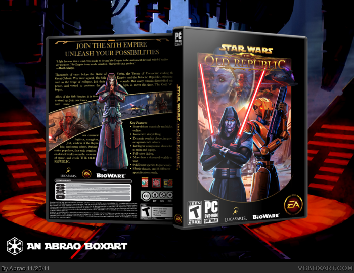
Here goes my version for SWTOR. Since there was never real Sith or Empire boxes for Star Wars and the game is a MMO where you choose your side, I decided to make a Sith version.
All the arts are from Bioware and LucasArts.
If it is popular, maybe I'll make a Jedi/Republic box next time.
Enjoy! And comments/suggestions are always welcome if I want to make progress.
Thanks for your comments. I did a minor update on the printable version for the curve frame on the front. It's not visible for the presention, only on the printable.
Loving the composition in the front, even though the "Old Republic" part of the logo is hard to read, I suggest using some technique to make it contrast against the image under it. I myself love crowded backs, but I think this box's would have done better with an a bit smaller font; also I think you should try to keep the text at an uniform distance from all the borders it meets (In this case, the render in the middle, the screenshots and these game awards.)
Overall, It's a pretty nice looking box, even though there are things that, I think, could be improved.
I think this is really creative as far as the back and screenshots go. I love that. However, the front looks boring, but that's probably cuz it looks official. which is good because the point of this is to make this box look official and thats exactly what you've done here. I like it. Although the text on black bg is kinda boring. good work though.
 Star Wars: The Old Republic Box Cover Comments
Here goes my version for SWTOR. Since there was never real Sith or Empire boxes for Star Wars and the game is a MMO where you choose your side, I decided to make a Sith version.
All the arts are from Bioware and LucasArts.
If it is popular, maybe I'll make a Jedi/Republic box next time.
Enjoy! And comments/suggestions are always welcome if I want to make progress.
[ Reply ]
Looks great dude.
[ Reply ]
truly epic.
[ Reply ]
Good work!
[ Reply ]
The back looks much better with the black background. Simple, but it works in coalition with the front.
[ Reply ]
Awesome, looks very official.
[ Reply ]
Nice work!
[ Reply ]
Thanks for your comments. I did a minor update on the printable version for the curve frame on the front. It's not visible for the presention, only on the printable.
Anybody interested on a Jedi/Republic version?
[ Reply ]
Looking good. The front looks very official.
[ Reply ]
Wow, great work! Like everyone else said, looks really official!
[ Reply ]
The classic SW poster thing works really well, and surprisingly, the simplistic back works just as well.
fav'd
Edited at 1 decade ago
[ Reply ]
Oh, I already commented.... The box is still epic in every form of the word.
[ Reply ]
I like it, nice and retro.
[ Reply ]
All the win ever!, I'd just say add some more effects on the back to spruce it up
[ Reply ]
#14, what kind of effects are you thinking exactly?
[ Reply ]
Loving the composition in the front, even though the "Old Republic" part of the logo is hard to read, I suggest using some technique to make it contrast against the image under it. I myself love crowded backs, but I think this box's would have done better with an a bit smaller font; also I think you should try to keep the text at an uniform distance from all the borders it meets (In this case, the render in the middle, the screenshots and these game awards.)
Overall, It's a pretty nice looking box, even though there are things that, I think, could be improved.
[ Reply ]
I think this is really creative as far as the back and screenshots go. I love that. However, the front looks boring, but that's probably cuz it looks official. which is good because the point of this is to make this box look official and thats exactly what you've done here. I like it. Although the text on black bg is kinda boring. good work though.
[ Reply ]
Nice. Captures the Star Wars feel very well. Front is really nice especially, back is good as well even if it a bit text heavy.
[ Reply ]