shadow [ Buy Shadow the H... at Amazon ] By JoeyTheHedgehog 36 on November 21st, 2011 No Printable Available [ Box updated on November 26th, 2011 ] [ original ] Shadow the Hedgehog 2 Box Cover Comments Comment on JoeyTheHedgehog's Shadow the Hedgehog 2 Box Art / Cover. Cancel Reply JoeyTheHedgehog 36 [ 1 decade ago ] My newest box. I had this done for a while, so I decided to upload it. ~credit~ renders-sonic.wikia logo- stevencho template-scorpion soldier [ Reply ] Rex_the_dinosoar 34 [ 1 decade ago ] That is awesome Joey! Looks pretty HoF worthy! [ Reply ] JoeyTheHedgehog 36 [ 1 decade ago ] #3, Thanks Rex! [ Reply ] Atexus 12 [ 1 decade ago ] Pretty generic, but well executed. [ Reply ] twoxT 34 [ 1 decade ago ] The back is "meh," but the front looks awesome. [ Reply ] JoeyTheHedgehog 36 [ 1 decade ago ] #5, #6, Thanks [ Reply ] YamiGekusu 34 [ 1 decade ago ] I like the overall design. The back is a little plain, but overall, very good :) [ Reply ] Ronthis the Werewolf 39 [ 1 decade ago ] Sweet man! [ Reply ] JoeyTheHedgehog 36 [ 1 decade ago ] #8, #9, Thanks! [ Reply ] ElCartel55 1 [ 1 decade ago ] awesome!! just one question: where'd you do that reflection effect? i really like it. [ Reply ] undead22 7 [ 1 decade ago ] This is awesome! I like the front the best. [ Reply ] deiviuxs 46 [ 1 decade ago ] I like the dark feel of the box but it's a bit too generic. Back follows the typical "tagline, description, screenshots" layout. [ Reply ] Abrao 34 [ 1 decade ago ] The back is ok, nothing extraordinary. The synopsis is "meh", it's not catchy. However, the front is really good and dark. [ Reply ] JoeyTheHedgehog 36 [ 1 decade ago ] I know I need to fix the back, but what should I do it? [ Reply ] AgentLampshade 46 [ 1 decade ago ] I really like the front, but as others have said, the back is a bit bland. [ Reply ] JoeyTheHedgehog 36 [ 1 decade ago ] ~Update~ -it says v3 because v2 didnt show up for me -fixed back(added more things) Edited at 1 decade ago [ Reply ] Magical 41 [ 1 decade ago ] The front is pretty good, but the back is plain. Nothing really stands out, but you still did a good job. [ Reply ] JoeyTheHedgehog 36 [ 1 decade ago ] #18, What should I do to the back? [ Reply ] darthnater 14 [ 1 decade ago ] Man, this is really, really good. I smell a HoF, and I'm helping this box get there. fav [ Reply ] Dario 23 [ 1 decade ago ] Really awesome box here! :) [ Reply ] JoeyTheHedgehog 36 [ 1 decade ago ] #20, Thanks! #21, Thank you! [ Reply ] amad2 30 [ 1 decade ago ] I quite like this. It's a pretty solid design, I don't like the blur you put on nearly everything though. Also, the shadow you added onto the cover is way too dark. [ Reply ] JoeyTheHedgehog 36 [ 1 decade ago ] Ill fix that [ Reply ] ChuckECheese123 33 [ 1 decade ago ] Nice box! The 3D and presentation mix well! [ Reply ]
 Shadow the Hedgehog 2 Box Cover Comments
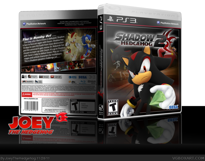
My newest box. I had this done for a while, so I decided to upload it.
~credit~
renders-sonic.wikia
logo- stevencho
template-scorpion soldier
[ Reply ]
That is awesome Joey! Looks pretty HoF worthy!
[ Reply ]
#3, Thanks Rex!
[ Reply ]
Pretty generic, but well executed.
[ Reply ]
The back is "meh," but the front looks awesome.
[ Reply ]
#5, #6, Thanks
[ Reply ]
I like the overall design. The back is a little plain, but overall, very good :)
[ Reply ]
Sweet man!
[ Reply ]
#8, #9, Thanks!
[ Reply ]
awesome!! just one question: where'd you do that reflection effect? i really like it.
[ Reply ]
This is awesome! I like the front the best.
[ Reply ]
I like the dark feel of the box but it's a bit too generic. Back follows the typical "tagline, description, screenshots" layout.
[ Reply ]
The back is ok, nothing extraordinary. The synopsis is "meh", it's not catchy. However, the front is really good and dark.
[ Reply ]
I know I need to fix the back, but what should I do it?
[ Reply ]
I really like the front, but as others have said, the back is a bit bland.
[ Reply ]
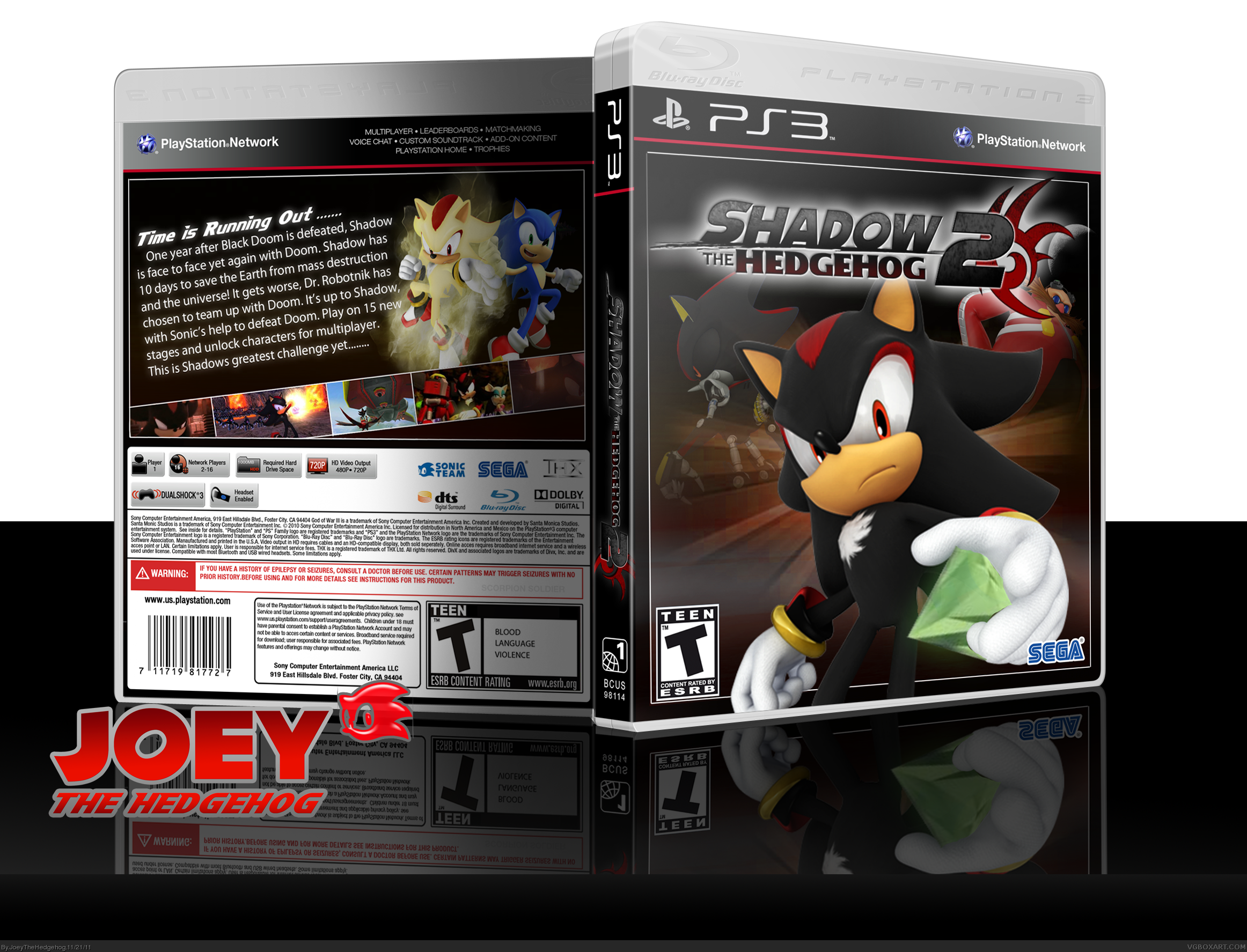
~Update~
-it says v3 because v2 didnt show up for me
-fixed back(added more things)
Edited at 1 decade ago
[ Reply ]
The front is pretty good, but the back is plain. Nothing really stands out, but you still did a good job.
[ Reply ]
#18, What should I do to the back?
[ Reply ]
Man, this is really, really good. I smell a HoF, and I'm helping this box get there. fav
[ Reply ]
Really awesome box here! :)
[ Reply ]
#20, Thanks!
#21, Thank you!
[ Reply ]
I quite like this. It's a pretty solid design, I don't like the blur you put on nearly everything though. Also, the shadow you added onto the cover is way too dark.
[ Reply ]
Ill fix that
[ Reply ]
Nice box!
The 3D and presentation mix well!
[ Reply ]