[ Box updated on December 8th, 2011 ] [ original ]
 Call of Duty: Modern Warfare 3 Box Cover Comments
Comment on JCRentertainment1's Call of Duty: Modern Warfare 3 Box Art / Cover.
[ Box updated on December 8th, 2011 ] [ original ]
Comment on JCRentertainment1's Call of Duty: Modern Warfare 3 Box Art / Cover.
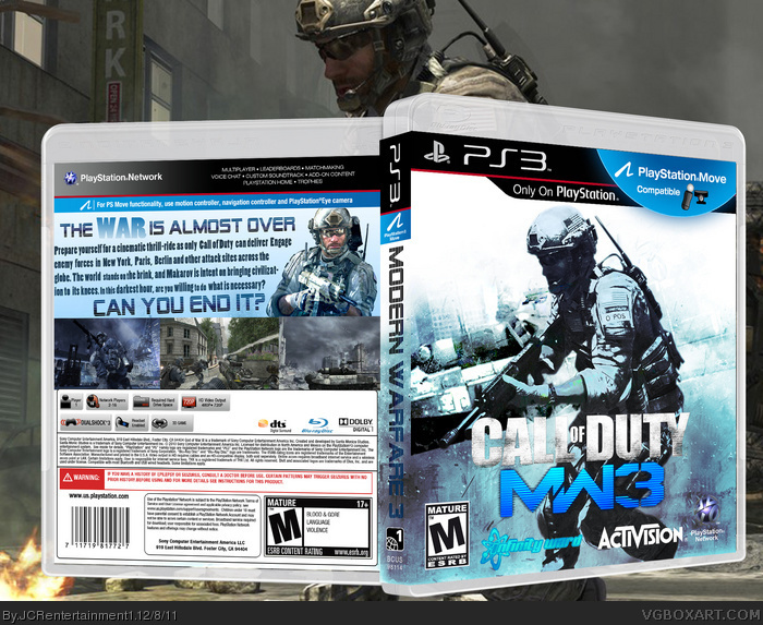
My fourth box hope you like it. Any constuctive comments will be helpful
[ Reply ]
Definitely choose a better font for the spine and back
[ Reply ]
#2, this.
[ Reply ]
i do also belive that the font is not the best for the type of game but i do like the more blue take on MW3
[ Reply ]
2# 3# 4# any ideas for the font?
Edited at 1 decade ago
[ Reply ]
WELL LIKE I SAID I LIKE THE BLUE BUT YOU COULD USE THE ACTVISION, INFINITY WARD AND SLEDGHAMMER LOGOS
[ Reply ]
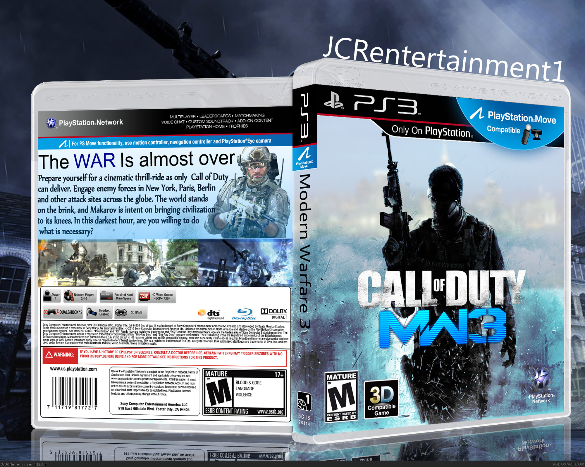
I have updated it is that better
[ Reply ]
ahh yes much better man. also, why did you change the brightness of the plastic part of the box?
[ Reply ]
I changed it because i saw a game like that in Game i think it was assasins creed so i thought i would try it out. Its a black plastic case
[ Reply ]
The blue is something different, but the images themselves need addressing. The darkly shaded, hard contrasted character doesn't blend well with the foggy, blurry background he's set against. The skyline in general is difficult to discern even in full-view, and even if meant to be out of focus(?) should be replaced.
The back doesn't share these issues, aside from a few blurred screenshots. The synopsis text is pretty large and thus space restricting, but otherwise I'm not seeing anything overly in need of fixing. The front should be the main focus, in my eyes.
[ Reply ]
Major Update!
[ Reply ]
Nice man i love the new update better than the old one
[ Reply ]
Cool
[ Reply ]
Thanks
[ Reply ]
wow! I love this version! It's my #1 favorite (and the reason I joined the site!)
[ Reply ]
Thanks
[ Reply ]
OMG. Printable copy please! :D
[ Reply ]
Please printable copys
[ Reply ]