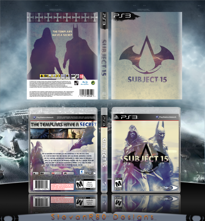
Ok well I guess I have to explain this. I was playing Batman Arkham City and Assassin's Creed Revelations when I had this idea, "How sick would it be if Batman and Ezio were in one game?!" Took a few hours to come up with a story, and this little box popped out. The front was originally a wallpaper I had made but I really wanted to see how it would turn out as a game. The Assasin's Creed logo with the batwings was an idea of mine as well :)
I have to be brutally honest here...im a little dissapointed. When I was looking at the WIP for this i was pumped. It started to look really good and the front is really creative, love the logo and the colors. But thats it...the back is very bland, looks very half-assed (no offence of course) plain, and very rushed. I think you needed to spend a lot more time on this to really get it to look great. This is just my opinion though. Very creative for the front combo.
#3 appreciate your criticism man. I'll admit I did get a little to excited to upload this but hey that's why they allow you to update right? I suppose I'm still not done.
Do you have any suggestions for the back? Because I actually like the back image and the headline.
#5, Yea try making some screenshots, will be tough but can be done. The color tone can also be changed for the back to match the front a little better. Its a little too dark right now. And notice how you have some white on the front at the top? Try adding some white in the back and will make it look more like its part of the front. The red bar at the top sticks out a little too much because there is no red like that anywhere else on the box, its too dark. I like it there though just needs to match the rest of the box. Work with that first and then see how it looks after.
Agreed. What you have so far looks great. But I would definitely update it with the suggestions people have given. This has the potential to receive a fav.
If I'd commented sooner, I'd have mentioned the back and the multitude of changes that should be made, but at this point I'd simply be repeating what's already been said.
The front's a quality example of a crossover done right, but the back is lackluster in more ways than not.
*Updated* for those of you who have been paying attention to my thread, this box got a major overhaul. The back is completely redone to match the front, custom screenshots were added, and a custom Eidos/Ubisoft logo was created. I am really pleased with the work I have put in and I am excited to hear what you guys think.
#15, Not bad. Much better than the original. The back is still a little eh, with the typography on it at least, Description text seems...off and out of place there. Its a very simple design for the back and you played it safe with it, which is fine, but still a much needed improvement over the first try. The only problem i really have currently is the presentation. Its supposed to be designed to make your work stand out more and make the box..."pop" so to speak. The exact same color blending your doing with your presentation is making the box blend it too much with it and its too distracting. Still, for all the effort and creativity, def worth a fav from me.
#16, where was this in the critique forum?! haha like I say criticism (good or bad) is always welcome and you always give me your thoughts flat out, which I like. I will work on the presentation, but I feel i've put enough effort into the box to just leave it as is. I appreciate the time you took to comment though, really helps :)
#17, haha your welcome. And yea i understand that all the time you put into this is probably enough. Nothing wrong with that. I will try and keep an eye out for your wok in the forums so i can critique there for your next project.
I see you've changed a lot since I last saw this. The new back layout is a massive improvement, and while it's an overall "safe" choice in terms of placement and arrangement, it works well and the colors compliment it nicely and keep things consistent. Nice job, and glad to see you take critiques seriously.
 Subject 15 Box Cover Comments
Ok well I guess I have to explain this. I was playing Batman Arkham City and Assassin's Creed Revelations when I had this idea, "How sick would it be if Batman and Ezio were in one game?!" Took a few hours to come up with a story, and this little box popped out. The front was originally a wallpaper I had made but I really wanted to see how it would turn out as a game. The Assasin's Creed logo with the batwings was an idea of mine as well :)
[ Reply ]
Wow, you finished this fast. It looks great. My only gripe is that there is a big empty space on the back. Maybe some screenshots?
[ Reply ]
I have to be brutally honest here...im a little dissapointed. When I was looking at the WIP for this i was pumped. It started to look really good and the front is really creative, love the logo and the colors. But thats it...the back is very bland, looks very half-assed (no offence of course) plain, and very rushed. I think you needed to spend a lot more time on this to really get it to look great. This is just my opinion though. Very creative for the front combo.
Edited at 1 decade ago
[ Reply ]
#3, Same.
[ Reply ]
#3 appreciate your criticism man. I'll admit I did get a little to excited to upload this but hey that's why they allow you to update right? I suppose I'm still not done.
Do you have any suggestions for the back? Because I actually like the back image and the headline.
Edited at 1 decade ago
[ Reply ]
#5, You should try and make some screen shots to use, I believe that why the back looks so empty.
[ Reply ]
#5, Yea try making some screenshots, will be tough but can be done. The color tone can also be changed for the back to match the front a little better. Its a little too dark right now. And notice how you have some white on the front at the top? Try adding some white in the back and will make it look more like its part of the front. The red bar at the top sticks out a little too much because there is no red like that anywhere else on the box, its too dark. I like it there though just needs to match the rest of the box. Work with that first and then see how it looks after.
[ Reply ]
I would change the template.
[ Reply ]
Agreed. What you have so far looks great. But I would definitely update it with the suggestions people have given. This has the potential to receive a fav.
[ Reply ]
#2, this.
[ Reply ]
If I'd commented sooner, I'd have mentioned the back and the multitude of changes that should be made, but at this point I'd simply be repeating what's already been said.
The front's a quality example of a crossover done right, but the back is lackluster in more ways than not.
[ Reply ]
Very interesting idea you have here. Plus, that logo is kickass. I'll FAV
[ Reply ]
#11 you are completely right. Like I said in the forum I'm aware that I rushed it and I am re-opening the WIP starting from the last forum update
[ Reply ]
Fun fact: Every time I play any of the Assassins Creeds, I always name my session "Subject 18."
[ Reply ]
*Updated* for those of you who have been paying attention to my thread, this box got a major overhaul. The back is completely redone to match the front, custom screenshots were added, and a custom Eidos/Ubisoft logo was created. I am really pleased with the work I have put in and I am excited to hear what you guys think.
[ Reply ]
#15, Not bad. Much better than the original. The back is still a little eh, with the typography on it at least, Description text seems...off and out of place there. Its a very simple design for the back and you played it safe with it, which is fine, but still a much needed improvement over the first try. The only problem i really have currently is the presentation. Its supposed to be designed to make your work stand out more and make the box..."pop" so to speak. The exact same color blending your doing with your presentation is making the box blend it too much with it and its too distracting. Still, for all the effort and creativity, def worth a fav from me.
Edited at 1 decade ago
[ Reply ]
#16, where was this in the critique forum?! haha like I say criticism (good or bad) is always welcome and you always give me your thoughts flat out, which I like. I will work on the presentation, but I feel i've put enough effort into the box to just leave it as is. I appreciate the time you took to comment though, really helps :)
[ Reply ]
#17, haha your welcome. And yea i understand that all the time you put into this is probably enough. Nothing wrong with that. I will try and keep an eye out for your wok in the forums so i can critique there for your next project.
[ Reply ]
*UPDATE* Changed the presentation to make the box "pop".
[ Reply ]
*UPDATE* Rearranged the back to get a more professional look. Thank you Deividas for all the advice!
Printable updated aswell
Edited at 1 decade ago
[ Reply ]
I see you've changed a lot since I last saw this. The new back layout is a massive improvement, and while it's an overall "safe" choice in terms of placement and arrangement, it works well and the colors compliment it nicely and keep things consistent. Nice job, and glad to see you take critiques seriously.
[ Reply ]
Fuck this is brilliant!
[ Reply ]
Didn't even see this comment haha much obliged my friend.
[ Reply ]
You did a great job of blending the two styles together. The layout is nice, if not a little boring. Pretty good job, overall!
[ Reply ]
*update* threw together a quick cover for the box.
[ Reply ]
Credit to Deividas for the template!
[ Reply ]