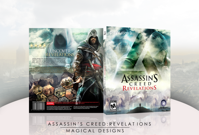
Here is my new box, Assassin's Creed: Revelations! I'm really proud of this, and think it is possibly my best box I have done. Credit to Soundwave for the template, and to Titan38 for the 3D of the box. Hope you all enjoy it!
Good work. Strong blending, a nice combination of colors, and the cloudy look works well. Altair could be more obvious on the front, unless that was an intentional decision. About the back, it shares many of the qualities of the front, but the features text could be adjusted. It's way too close to the edge of the cover, and is obstructed by Ezio on the other side. Since there's still room between it and the screenshots, I'd suggest adding another line of text.
Nicely done. Great use of colors and a decent composition. The yellow text on the back was a tiny bit difficult to read (maybe consider adjusting the tracking) but overall i really like this.
THIS IS REALLY GREAT. I dont understand why there is no printable version... Im new here, and I would really appreciate if the great artwork be shared to my email, teo123inamoski@yahoo.com ...MORE POWER TO THE CREATORS OF SUCH AWESOME ART!!! ---FilipinoGamer
 Assassin's Creed: Revelations Box Cover Comments
Here is my new box, Assassin's Creed: Revelations! I'm really proud of this, and think it is possibly my best box I have done. Credit to Soundwave for the template, and to Titan38 for the 3D of the box. Hope you all enjoy it!
[ Reply ]
This is quite amazing.
[ Reply ]
Shit this is nice.
[ Reply ]
Oh, and I almost forgot. Thanks to the people who helped in the Wip!
[ Reply ]
As I mentioned, I really love the way this turned out!!
[ Reply ]
Like I said in the WIP forum, you have done a great job on this. The colors look awesome and the composition of the front is just perfect.
[ Reply ]
Love it! There's a little bit of an issue with the quality on the ezio render (on the back) but it's not that big a deal. Awesome job man.
[ Reply ]
Now this is sexy!
+Author Fav (Don't know why it took me so long to do that)
Edited at 1 decade ago
[ Reply ]
I came, I saw, I came in my pants.
[ Reply ]
Very nice job!!
[ Reply ]
Very impressive. Massive fan of the originally and subtlety of the front.
[ Reply ]
Stunning work. You made much better use of that artwork than I did.
[ Reply ]
Good work. Strong blending, a nice combination of colors, and the cloudy look works well. Altair could be more obvious on the front, unless that was an intentional decision. About the back, it shares many of the qualities of the front, but the features text could be adjusted. It's way too close to the edge of the cover, and is obstructed by Ezio on the other side. Since there's still room between it and the screenshots, I'd suggest adding another line of text.
Either way, very nice job.
[ Reply ]
Nice! :D
[ Reply ]
Thanks for all the nice comments, guys!
[ Reply ]
Nicely done. Great use of colors and a decent composition. The yellow text on the back was a tiny bit difficult to read (maybe consider adjusting the tracking) but overall i really like this.
[ Reply ]
Love this one!
[ Reply ]
How is this not hall yet?
[ Reply ]
THIS IS REALLY GREAT. I dont understand why there is no printable version... Im new here, and I would really appreciate if the great artwork be shared to my email, teo123inamoski@yahoo.com ...MORE POWER TO THE CREATORS OF SUCH AWESOME ART!!! ---FilipinoGamer
[ Reply ]
Thanks for the Hall guys!
[ Reply ]
Well deserved.
[ Reply ]