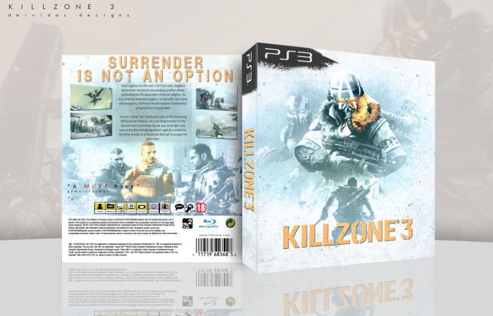
My newest BoxArt. Not really much to say on this one, The front took me a very long time to create while the back just kinda fit together quite nicely i would say on the first try, Anyways comments and favs are always welcome :)
 Killzone 3 Box Cover Comments
Comment on Deividas's Killzone 3 Box Art / Cover.
The layout looks good, but I have an issue mainly with the color. It seems really washed out on the entire box. The box itself is good, despite the back having a slightly generic design, but I don't care for the colors too much.
[ Reply ]
This!
[ Reply ]
Great cover. I like it.
[ Reply ]
Nice work! About the colors I agree with Spiderpig. Orange color should be stronger. And I think the logo and tagline is boring, it should be overlay or something. Tagline should be moved down a bit though. =)
[ Reply ]
Nice work.
[ Reply ]
Nice color scheme!
Lovely :)
[ Reply ]
nice
[ Reply ]
The colors are nice, and I actually am a fan of the washed out images, but the design in general is relatively generic. A solid work either way.
[ Reply ]
Awesome Box, keep up the good work
[ Reply ]