![]() »
»
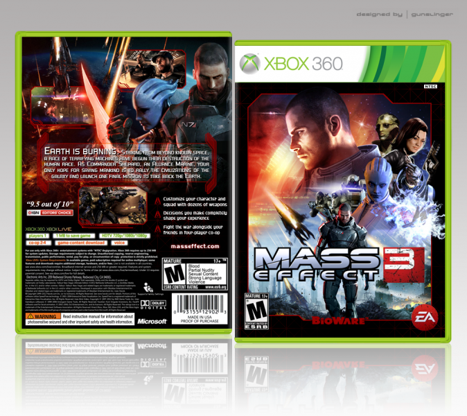
With my anticipation pretty high for the release of this game I felt now was a good a time as any to complete my Mass Effect trilogy of box arts. I wasn’t 100% sure on what characters were definitely returning so I used my favorites from the previous game. I’m pleased with the end result. As always your crits and comments are very welcomed and appreciated.
Enjoy. ^_^
 Mass Effect 3 Box Cover Comments
Comment on Gunslinger's Mass Effect 3 Box Art / Cover.
Nice! Before you even posted a box I had an idea of what the front will look like and it looks like almost exactly how I envisioned it to look like. However, I feel the front is to cramped especially the right side. Back is nice but that blue female thing (don't know her name) looks out of place. All in all, great design for what looks to be an awesome game.
[ Reply ]
You included Thane on the cover. Respect points +1000.
[ Reply ]
Nice! Very, very stylish and this in a very unique style. I like the red borders. THe front is fantastic, BUT I don't like two things: The render of the main character behind the font looks odd and not well placed. He sticks out too much. Maybe it would be better with him completely gone? (he's already on the front anyway) AND I don't the strong black stroke around the logo. It sticks out too much, too. Maybe this could be done smoother?
For the rest: Perfect box, would make a great official.
[ Reply ]
I love it, Good work man !
[ Reply ]
Damn, that's awesome! If I could make one suggestion it would be to make the Shepard on the front (standing) into the female Shepard, looks a bit odd with him twice on there. Overall great composition and colors, all these boxes are getting me even more hyped up for the game :D
[ Reply ]
So pretty, I'm very impressed. :)
[ Reply ]
Good work. I suppose the only thing I don't like is the text after "Earth is Burning." It blends in a bit too much with the square pattern.
[ Reply ]
Shocked by the awesomeness !
[ Reply ]
Apart from the somewhat cluttered characters layout on the right corner on the front, the akward font choice for the quote at the back and the synopsis readability at some parts is not optimal imo. Other than this, It looks very official and well excecuted, nice job.
[ Reply ]
I like it. Though everything seems to be balanced over to the right. I would have liked it more centered.
[ Reply ]
Stevencho... REALLY likes this cover, I suppose.
It is good, though, so the repeated praise is not without reason. The right side of the front seems kind of crowded though, the characters all packed tightly together in a cramped space. That density is really all that's holding the front down, and freeing up some space between the characters would do the design a lot of good.
[ Reply ]
Winning. :)
[ Reply ]
Love the Star Wars type feel you've achieved with this design.
[ Reply ]
Great stuff here dude, the front reminds me of the old Star wars movie posters.
The only thing I would say is that teh right hand side is a little crammed, maybe if you move Sheperd's head a little you can space it all out a little more.
[ Reply ]
Veri nice.
[ Reply ]
favorite mass effect 3 cover and amaizing job! :D
[ Reply ]
plis,printable!!!!!!
[ Reply ]
This is great. deserves more attention .
[ Reply ]
The Star Wars style montage's that you created for the front was always your greatest skill.
[ Reply ]
Good work man but No Download Printable
[ Reply ]
I love seeing old covers getting into HOF
[ Reply ]