I'm sorry, I dislike this box, due to the heavy use of the Final Fantasy font. I HATE that font for written text, it's very clunky and unreadable.
Really, sorry, the design is really quite solid, if a bit plain, but the font puts me off greatly.
Opinion is opinion Haha. No worries. I love the font. It is final fantasy. You may change your mind if you did a full few. The font it beautiful when you see it's design. As an Atari box you can't go insane like new gen system. You need just the flare that shows the game!
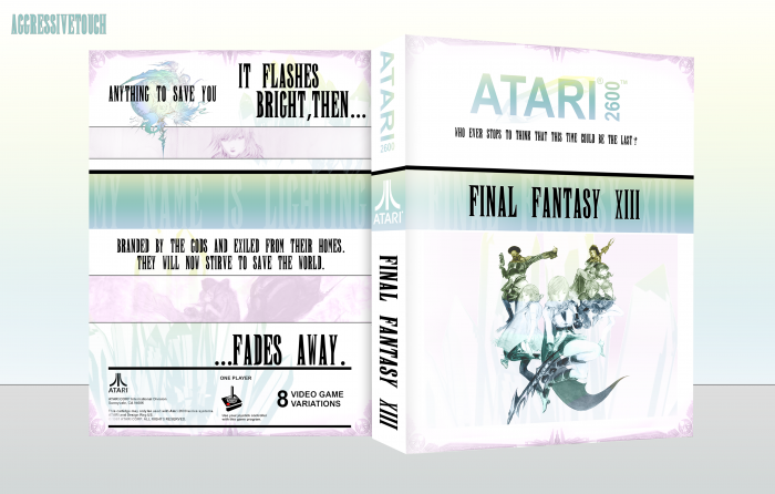
Not necessarily retro, but I'm fine with that. It's an interpretation of XIII you don't see very often, and I think it was executed quite well. Using Amano's artwork was a solid choice.
All I can really say, from a negative point of view, is the that the font choice could have been better. I've never liked the unofficial font, due to the inconsistency in size between letters. A bit more various, specifically in the text serving as story descriptors, would have been well advised.
Still, I can't fault you too much. It's still a very nice cover, and I like that you used Lightning's quote regarding her name's meaning, instead of something more generic.
 Final Fantasy XIII Box Cover Comments
It doesn't scream retro, but it's nice nevertheless.
[ Reply ]
Haha thanks :) I didn't want to go too retro! This is an interpretation of new gen gone old school. "Plain" would never describe FF XIII.
[ Reply ]
I'm sorry, I dislike this box, due to the heavy use of the Final Fantasy font. I HATE that font for written text, it's very clunky and unreadable.
Really, sorry, the design is really quite solid, if a bit plain, but the font puts me off greatly.
[ Reply ]
Opinion is opinion Haha. No worries. I love the font. It is final fantasy. You may change your mind if you did a full few. The font it beautiful when you see it's design. As an Atari box you can't go insane like new gen system. You need just the flare that shows the game!
[ Reply ]
Glad to see you're back! Great box too!
[ Reply ]
Thank you very much,hun!
[ Reply ]
Texts on the back are a bit mess, I don't know where I should read first, lol. But this is really nice box, different from others. :D
+Fav.
[ Reply ]
Thanks. Yeah!
[ Reply ]
Not necessarily retro, but I'm fine with that. It's an interpretation of XIII you don't see very often, and I think it was executed quite well. Using Amano's artwork was a solid choice.
All I can really say, from a negative point of view, is the that the font choice could have been better. I've never liked the unofficial font, due to the inconsistency in size between letters. A bit more various, specifically in the text serving as story descriptors, would have been well advised.
Still, I can't fault you too much. It's still a very nice cover, and I like that you used Lightning's quote regarding her name's meaning, instead of something more generic.
[ Reply ]
I needed to make sure it was plain enough to be retro fitting. Thanks :)
[ Reply ]