Interesting idea...but not the best execution. Image quality is low, logo is too small and to close to the edge. Background is too simple and looks unprofessional.
1.) The font you chose on the back (I'm assuming Impact) was a poor choice.
2.) The drop shadows on the front take away from the quality of it.
3.) The back's screenshots have poor borders.
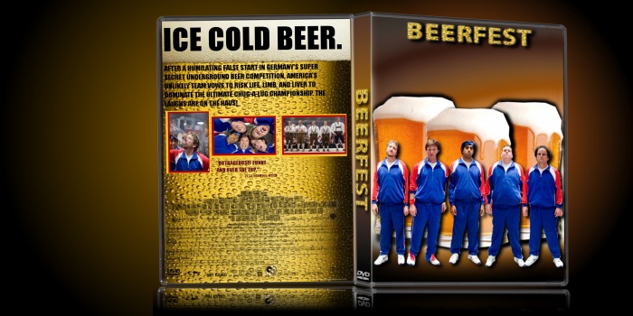
 Beerfest Box Cover Comments
damn the be a nice box
[ Reply ]
I'm only here for the ice cold beer :P
[ Reply ]
That rhymed!
[ Reply ]
Seems interesting movie :p I have to point out the image quality isn't the best, but I like the creativity on the back cover and overall concept.
[ Reply ]
Nice man! Box looks great.
[ Reply ]
don't like the back too much, and the 3d isn't good either.
[ Reply ]
Kind-of, but it's alright.
[ Reply ]
Interesting idea...but not the best execution. Image quality is low, logo is too small and to close to the edge. Background is too simple and looks unprofessional.
[ Reply ]
I like the front but the image quality over all is poor if u can better images i'd like it a whole lot more.
[ Reply ]
I have to agree with Deiviuxs, I like the idea, but the execution seems a bit off.
The black and red text looks a bit tacky, in my opinion.
[ Reply ]
The text on the back sticks out and looks unattractive. The legal information is barely visible.
[ Reply ]
Bottom text on back blends in with background, and images are low quality.
[ Reply ]
Nice box ;)
[ Reply ]
A few tips:
1.) The font you chose on the back (I'm assuming Impact) was a poor choice.
2.) The drop shadows on the front take away from the quality of it.
3.) The back's screenshots have poor borders.
It's an okay box, but nothing too special.
[ Reply ]