![]() »
»
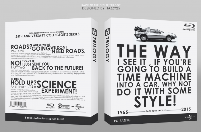
I tried to go more about the typography for this box than the actually images. I used all my favorite quotes from the movies and tried making it unique, minimal and different as possible. I really enjoyed making this box. I'll update it if i can find any mistakes or if you guys could tell me what I can improve on. Cheers.
PS: Check printable for HD
[ Box updated on April 14th, 2012 ] [ original ]
 Back to the Future Box Cover Comments
Comment on Hazzy25's Back to the Future Box Art / Cover.
Cool
[ Reply ]
Oh goodness this is nice. I just love the quote you decided to use on the front, fits perfectly.
[ Reply ]
Thanks! Thats my fav line in the films
[ Reply ]
That template is really nice, so nice that I might have to steal it. >:)
Just thought I'd warn you. The box too, I like it.
[ Reply ]
Go ahead, nothing to special about it.
[ Reply ]
Niceeeeee
[ Reply ]
Well done!
[ Reply ]
Looks amazing. But on the front, it should be YOU'RE.
[ Reply ]
thanks, I'll make sure to fix that soon.
[ Reply ]
Fixed
[ Reply ]
Great box!
You're missed the ' in DONT on the back near Part 1, and there's a random comma just after Part Three.
[ Reply ]
Where abouts? The comma in Part3 is for the "its a".
[ Reply ]
He is talking about the DONT in the first quote on the back "Roads ? Where we're going, we DONT need roads."
Awesome box by the way !
[ Reply ]
Great Scott...
[ Reply ]
Oh, this is heavy.
[ Reply ]
Nice.
[ Reply ]
Congrats man! Well deserved on this one
[ Reply ]
Thanks alot.
[ Reply ]
Finally! it had to be HOF one day ;)
I totally forgot to comment on the box :/
I really like the way how you turned typography into something exciting and attractive :) and to lay the focus on the text rather than on the image, but still making this box close to the movie with the simple use of a nice image of the Delorean time-mobile.
and last but certainly not the least, the custom template compliments the overall look, incredible job!
[ Reply ]
Thanks. I might make a Temp of the custom template if anyone wants it.
[ Reply ]
Thanks for the HOF guys. Means alot.
[ Reply ]
Typography is lovely.
[ Reply ]
Could I be cheeky? Ask for a version that has '1885' instead of '1955' on the front
[ Reply ]