Credit goes to BeardedWalrus for the template. I used Google and Planet Renders for everything else.
 Final Fantasy XIII-2 Box Cover Comments
Comment on Arby Works's Final Fantasy XIII-2 Box Art / Cover.
Credit goes to BeardedWalrus for the template. I used Google and Planet Renders for everything else.
Comment on Arby Works's Final Fantasy XIII-2 Box Art / Cover.
Turned out nice, but you should DEFINITELY make the presentation 3D. It makes the box a lot more appealing.
[ Reply ]
I think this design would look great as a GOTY edition, with the DLC in those bars, but this looks cool as well.
[ Reply ]
Hmm, should I make it GOTY edition when I update it with a 3D presentation?
[ Reply ]
@Arby Works I would seriously consider it.
[ Reply ]
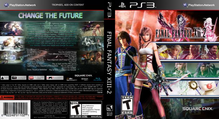
I like the general layout, but on a technical level I think a bit of fine tuning is needed for this to reach it's fullest potential. You have a variety of ideas in place, but at the moment they don't flow together to form a cohesive design. Some consistency is needed.
Stylistically speaking, the FFXIII games are, in a word, sleek. The color scheme should reflect that. Vibrancy is fine of course, but there should be a consistency to it. At the moment, the color scheme is a bit all over the place. With the upper half primarily red, the character borders stroked in blue, the colored gradients, and multi-colored drop shadows respective to each character, it's something akin to what I'd expect from the quirky Persona 4.
A few other suggestions that stem more from personal opinion than anything: 1) Maybe try centering Noel and Serah, with the character borders stretching from the left to right edges? 2) Maybe use a logo without Amano's illustrations, to lessen the crowd of imagery and increase the cleanliness of the design?
Just rambling off a couple of ideas, really. The coloring and stylistic inconsistency is the only thing I think should be addressed.
As for the back, I'm fine with the emphasis on text and feature listing. Very "Game of the Year"-like. There are only two issues that stick out to me: 1) Again, the coloring could be toned back. The rainbow tagline, specifically. 2) I'd try cleaning up the feature listing in the lower half. A larger space between the item and it's description, for example.
Hopefully these suggestions help. I'd only like to see this design grow and develop further.
[ Reply ]