PRINTABLE HERE: link
Umm... So I posted it? Thanks for everyone who helped in the WiP thread. I wanted to have a lot of space on the front to represent the vastness of the game somewhat. And please also check the printable (Sorry for low quality, couldn't fit it in 8MB), and credit to deiviuxs and Sens for the plastic.
[ Box updated on June 10th, 2012 ] [ original ]
 Binary Domain Box Cover Comments
Comment on Sarashi's Binary Domain Box Art / Cover.
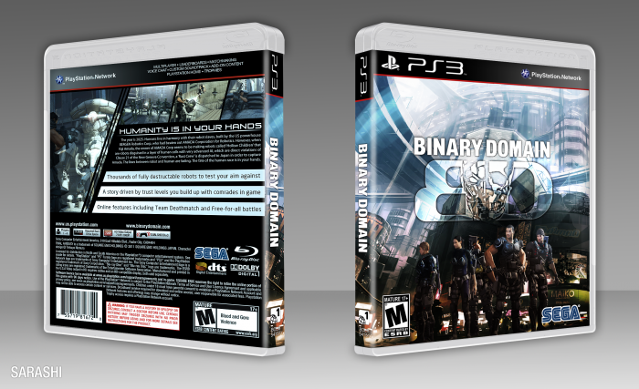
I do think the characters on the front could use a bit more contrast to stand out from the scene, but it's not really a big deal.
The back looks really solid, I just wish there was something continueing (like for instance, the color scheme) from the front onto the back.
Anyway, it does the game justice ;)
[ Reply ]
I tried making it more contrasty on the front,but it looked WAY too contrasting then (It was separating into primary colours)
I guess I could tint the screenshots to continue the colour scheme, what do you think?
[ Reply ]
@Sarashi That would work.
[ Reply ]
@Bastart Updated with a back-wide tint (I tried selective area tinting, but it looked off)
[ Reply ]
@Sarashi Much better ;) it adds just the right amount to balance the overall look, excellent job!
[ Reply ]
I Like this, realy nice.
[ Reply ]
I don't actually really see a difference in terms of quality, between the one you've uploaded on here and the one at the external link? I think VGBA could handle more than 8MB printables? because it's over 8, but I just downloaded it from here?
[ Reply ]
Not really, I added the tint to the printable which I had already downscaled. The only reason I posted another link was that the printable link on the site is slow to update.
[ Reply ]
@Sarashi I've updated with a much bigger original printable link
[ Reply ]
I previously felt the characters could take more prominence on the front, with Travis Willingham's character taking center stage. However, after reading your description I'm seeing the cover in a new light, and I think you pulled it off pretty well. Nice work.
The back falls under a category of design I see quite often in your designs. Not necessarily a negative thing, but never ill-advised to experiment and take risks creatively.
[ Reply ]
To be honest I have no other ways of making a back without making it look awful :/
Thanks for being honest though, can't get better otherwise :)
[ Reply ]
Something that can be helpful is examining the game you're working with, looking for key elements that define the game visually. A crude example: if you were making a Dead Space cover, you could try creating a layout - screen borders, synopsis, etc. - that mimics the holographic nature of the HUD.
Trying to incorporate in-game elements in the design can prove a nice challenge, but can also result in something different than the usual.
[ Reply ]