![]() »
»
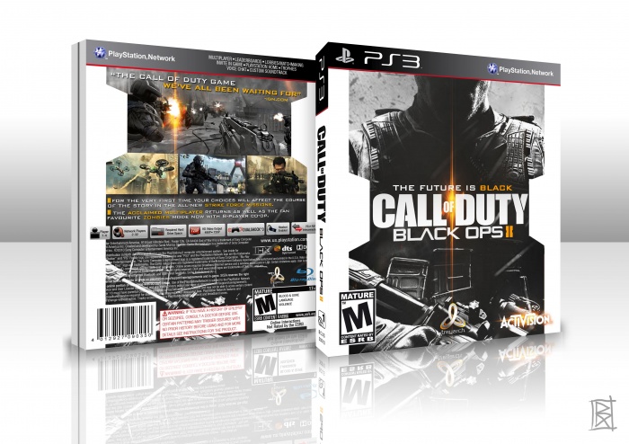
Thinking I could have probably put more work into this but knowing me I thought it best to just get it done, otherwise I may not have got it finished at all. Because I lose interest in a project quite quickly, thats pretty much why i've only got a few boxes submitted in the past year... Anyways for the back I just went for something simple, like the official backs of the games are. Hope you enjoy.
 Call of Duty: Black Ops 2 Box Cover Comments
Comment on goku252525's Call of Duty: Black Ops 2 Box Art / Cover.
Awesome, excellent job resonating the lens flare on the back as well.
[ Reply ]
F****** AWESOME :)
[ Reply ]
I'm not a fan of black ops 2 , but This is really great .
[ Reply ]
Fantastic...
[ Reply ]
very nice man great work.
[ Reply ]
lens flares seems to be the new fashion lately in boxart designs ;)
[ Reply ]
this is great!
[ Reply ]
ooOOoo very nice design. I'm not sure if you meant for the white borders to be like an inverse of the II in the logo but I really like it. The quality on the front image as well as those jutting parts on the white border are really killing me though :///
Another part I'm not liking is how close the back text under the screens is to the white part it's just a bit too tight. I like the way you used the lens flare though, very classy.
[ Reply ]
Yes the white borders were meant to reflect the II, was my main reason for doing it in the first place.
I completely agree with the back text! I thought it was a bit too close aswell, i think i just wanted it to be a certain size, wanted it to be easier for the kids to read! haha. But if i upload a printable I will look into changing it and fixing up the borders.
Thanks for the comment!
[ Reply ]
Congrats!
[ Reply ]
Thanks man! Didnt expect this!
[ Reply ]
I don't know how I missed this.
Great work man, a really fresh looking COD box.
[ Reply ]
I really like your framing device. It’s a smart way to construct a design within the "II".
The neatest of the simplicity really stands out from the cliché COD box art designs.
Fav
[ Reply ]
Decent concept you have going on but the quality is lacking severely. Also it needs a good going over with execution. The white tabs on the front aren't even straight and that is a pretty simple task, the white copyright text bleeds off pretty badly, the 3D alignment is different from the front and back, the screen shots aren't aligned on the bottom, and bunch more. Try to always design in 300dpi. If that isn't possible due to lack of art go to 150dpi.
You have been designing for a while and I would think it would be a lot cleaner. Don't rush a box. Even when I finish I spend hours touching up pixels, cleaning up lines, making the ESRB the same pixels away from the side/bottom as the other logos.
The difference between great and excellent is that little bit more.
[ Reply ]
This is realy awesome...
[ Reply ]
O.O THIS IS AMAZING
[ Reply ]
Clean and nice attention to detail! Love it!
[ Reply ]
OMG!! this is Amazing, please someone call Treyarch and tell them the cover for the game has been made... PLEASE USE IT... Man this is Awesome... I would buy the game in a heartbeat if that was the cover, that just looks badass...
[ Reply ]
Good Work
[ Reply ]