![]() »
»
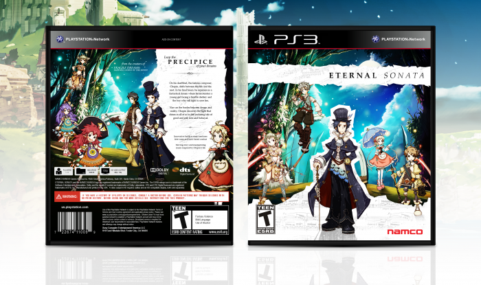
Beautiful game. Hopefully I did it justice.
[ Box updated on June 30th, 2012 ] [ original ]
 Eternal Sonata Box Cover Comments
Comment on Pleiades's Eternal Sonata Box Art / Cover.
Look the PRECIPCE of your dreams?
I think there is something missing.
[ Reply ]
Of all the words I could misspell, you'd think the tagline would be the last. Thanks for pointing that out.
[ Reply ]
Good work, as usual.
[ Reply ]
Very distinct look you've got going. I love it.
[ Reply ]
Not sure how much I like the floating characters on the front and back but otherwise great work.
[ Reply ]
Floating characters? If you're referring to Viola and Allegretto, the former is standing amongst the trees, and the former sitting atop that stone perch. Thanks for commenting.
[ Reply ]
I love that enchanting sense of fantasy that this box gives off.
[ Reply ]
Thanks for the comments, guys, I'm always looking for more feedback.
I actually made this specifically to print out, as I'm planning to get this for PS3 soon and wanted to replace the official cover. Speaking of which, printable has been added.
[ Reply ]
Holy crap, I just noticed that the white part is actually sheet music. That's awesome. This is probably my favorite from you.
[ Reply ]
Yeah, that was a concept I've always wanted to work into an Eternal Sonata cover. Glad you noticed. :]
While I'm not sure I conveyed it quite clearly enough, the white space surrounding Chopin is actually supposed to represent the separating line between his reality and the dream world. The sheet music I believe is from Chopin's own work.
[ Reply ]
A piece of art right here. I just don't like the torn effect, if it looks real I think this box will be better.
[ Reply ]
Not bad, not bad. I absolutely LOVE the game. But I have to agree with hesit8; especially Allegretto seems to float there.
But nice approach. I like the front very much.
[ Reply ]
Spectacular. The typography and that music note effect are beautiful.
[ Reply ]
Very underrated.
[ Reply ]
I always like color of your cover, It's seems kinda signature for your work, And this one absolutely deserve more attentions, Good work.
[ Reply ]
Wow, this is a very beautiful cover. The different colors on the front are plain fantastic. I love how you used music paper, great job! (+ fav)
[ Reply ]
this is a REALLY cool design, deserving of masterworks
[ Reply ]
Too bad that doesn't exist anymore.
[ Reply ]
Congrats man, and you get brownie points for the integration of Chopin into the design. :D
[ Reply ]