I really hope you like it. it was harder to make than it looks like. Please leave a comment, if you like it or not.
[ Box updated on July 4th, 2012 ] [ original ]
 Dead Island: Riptide Box Cover Comments
Comment on DeadIslandForever's Dead Island: Riptide Box Art / Cover.
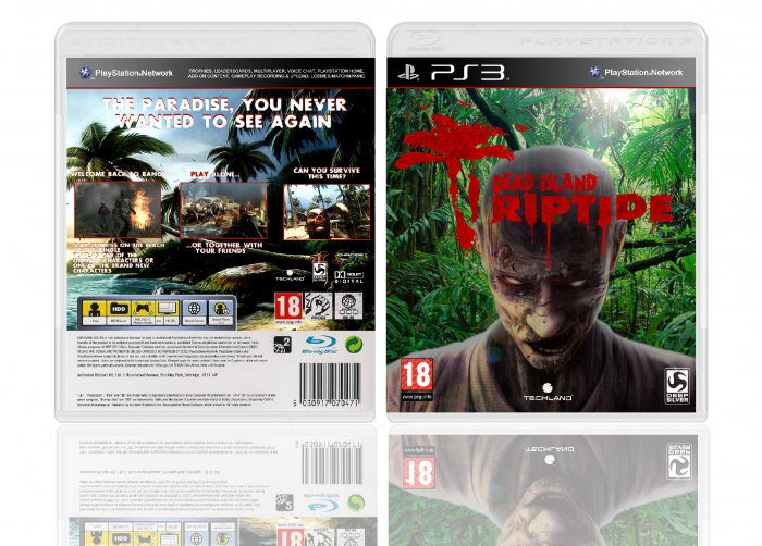
I like the front and you did a great job on making the 'Riptide' be part of the 'Dead Island' logo, but the Techland is hardly visible, I'd suggest to make the font of the logo white.
The back looks a bit messy to be honest. The screens could use some borders and the dimensions of the screens looks better if they were less square and a bit smaller imo. Try using a font that's easier to the eye, because right now it's to bold and the red color isn't helping either :/
also try to find a more suitable font for the tagline, there's lots to choice from at dafont.com and don't forget to add some legal info, so the gap between the specs and barcode ect. is filled.
Make the Blu-Ray logo smaller (try to find one that's much better in quality) and add some logo's (like 'Dolby Surround' for example) it makes the box much more professional looking.
It's certainly not bad box though, just try to update it with a few changes, especially n the back, try to find a layout that works with both the text and the screens.
[ Reply ]
Thanks for the suggestions to improve it. I will try to make a better one today
[ Reply ]
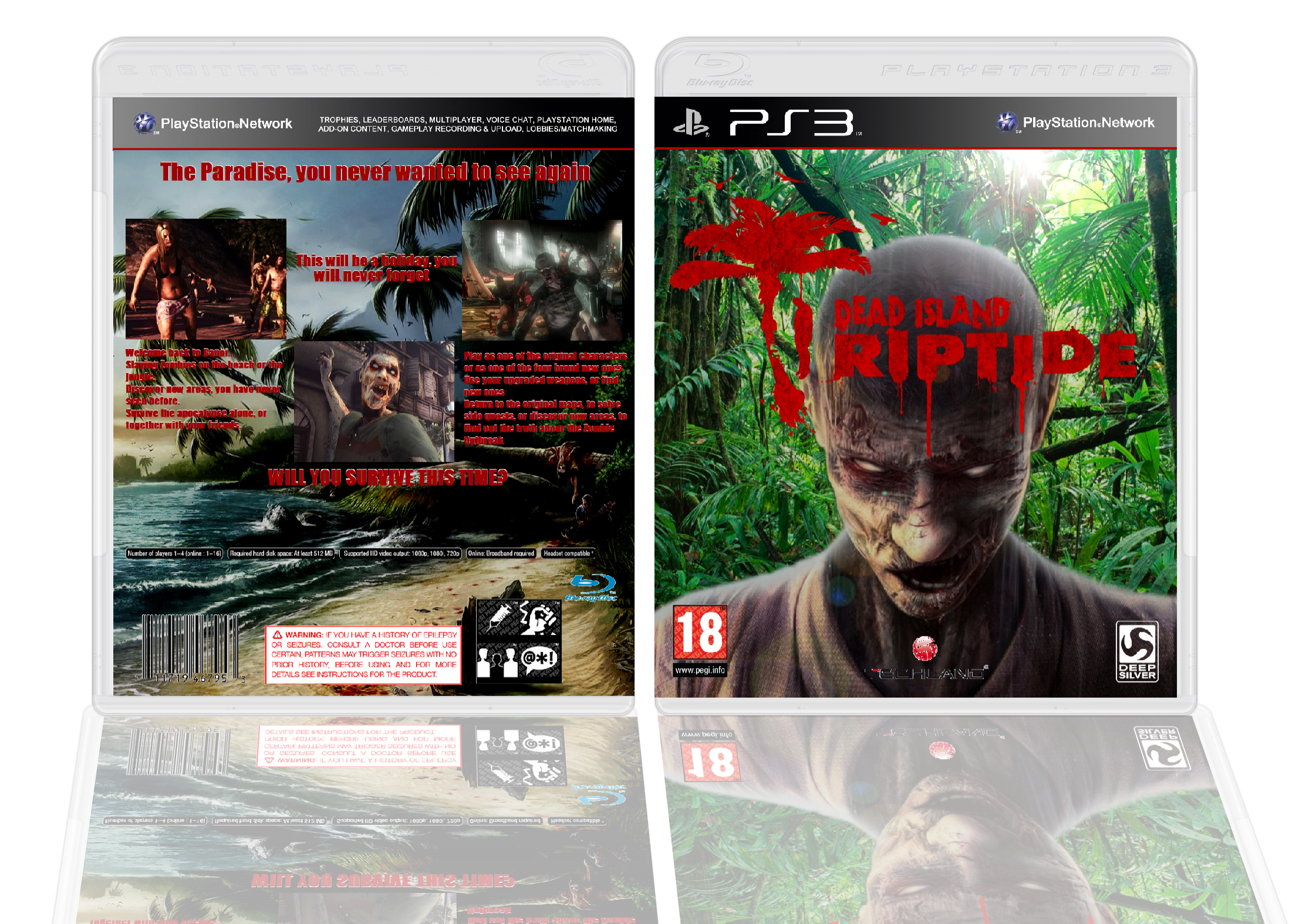
I updated to cover now. I hope it's better.
[ Reply ]
@DeadIslandForever It's much better, but the text could use a bit of shadow on the back (especially on the left side of the back, that appears to be very light) to make it easier to read. I'd also move the screens and descriptions closer to the tagline, so the gap in between is reduced quite a bit (or just move the tagline down a bit, that's up to you)
I'm not entirely sure, but is there suposse to be a region code on the back of an european PS3 template? Anyway, a great update, just try to fix those things I've mentioned above.
[ Reply ]
A good box is here, it just needs to be tuned up a little. Try blending the zombie in the front in more by adding a tint or a filter to the overall cover to make the images look more coherent. Also, your logo on the front would benefit greatly from a small black outer glow
[ Reply ]