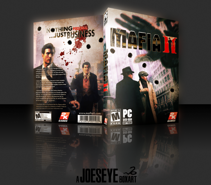
I've just completed this game and thought it's been a while since I've made a box. I felt the accuracy, atmosphere, setting and visuals of this game were great, and tried to reflect that through my box.
Thank you for viewing.
 Mafia II Box Cover Comments
Comment on Joeseye's Mafia II Box Art / Cover.
Oh My God This Is Amazing .
[ Reply ]
Very nice, I like it...
[ Reply ]
outstanding:)))
[ Reply ]
The logo could be better...
The outline isn't needed imo.
[ Reply ]
Yeah, it wasn't originally there, but I felt that the chrome outline was necessary as the black logo wasn't very distinguishable against the dark/high contrast background, and it looked better than being white. I thought the reflective surface I added to the logo reflected the glossiness and feel of the 50s city setting. Thanks for the feedback though.
[ Reply ]
The game is great and this box does it justice.
[ Reply ]
The template on your last box looked better. I like the way you made the O in Nothing into a bullet hole.
[ Reply ]
Thanks, I probably agree with you on the template, to be honest. It's just this is more common for NTSC boxes.
[ Reply ]
Great...
[ Reply ]
Highly classy!
[ Reply ]