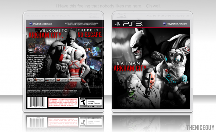
New box, pretty happy with it. The front mirrors the batman forever poster, (insert boring description) tell me what you guize think.
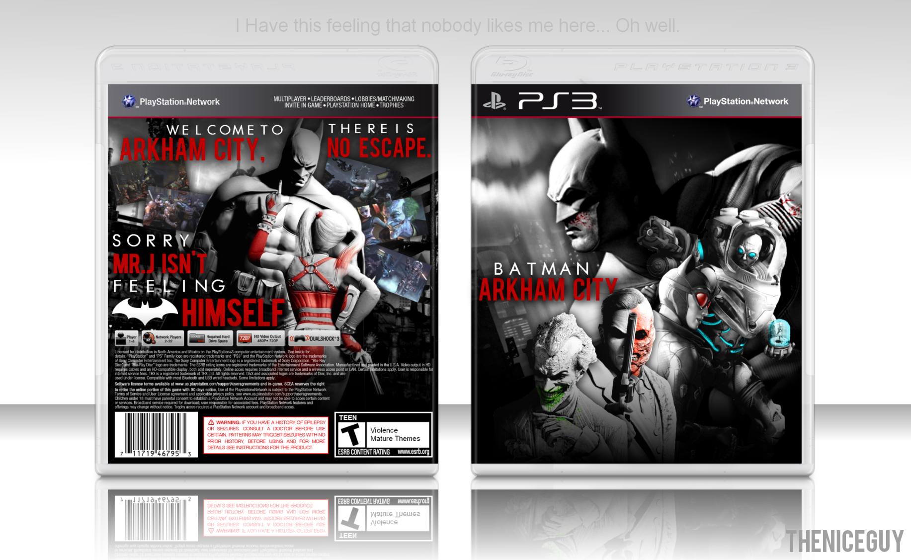
[ Box updated on July 24th, 2012 ] [ original ]
 Batman: Arkham City Box Cover Comments
Comment on TheNiceGuy's Batman: Arkham City Box Art / Cover.
Looks prettyful. Great job!
[ Reply ]
And LOL at the text in the presentation.
[ Reply ]
Looks great, love the text, renders and design! But wait, where are the front logos/esrb?
[ Reply ]
I didn't want them to interfere with the rest of the box. I was going to do the same on the back, but I didn't need that much space.
[ Reply ]
@TheNiceGuy I see, it looks really nice without them.
[ Reply ]
Ommm , Good Use Of The Screenshots On The back , It Will be better To Make The Batman AC Logo A little Bigger . Ha ?
[ Reply ]
The red text on the back is a bit overbearing but overall, this is a pretty good box.
[ Reply ]
This. Excellent work overall.
[ Reply ]
I like the front a lot, however, I don't think ESRB and dev logos would have ruined it.
Back on the other hand could use some improvement. I feel that there is too much red text or it's too big because it's kinda distracting. Screenshots are also buried in the art and hard to see. Either remove them or re-arrange back's layout.
[ Reply ]
Any suggestions on how to change it?
[ Reply ]
Well done...
[ Reply ]
okay updated it, how is it now?
[ Reply ]
Looks great. :D
[ Reply ]
This deserves more attention than it is getting.
[ Reply ]
The logo on the front just doesn't feel right imo. (it's to small and to close to the edge of the spine) I really like the back though, despite the synopsis looking a bit cramped to me and some logos on the legal info should get rid of the blank space.
[ Reply ]
I'll try to fix it.
[ Reply ]
It's good... I like the random placed logo and characters because it's not the usual that we see everytime
[ Reply ]
This looks amazing, but I would add the dev and esrb logos. I don't think they would ruin the box,
[ Reply ]