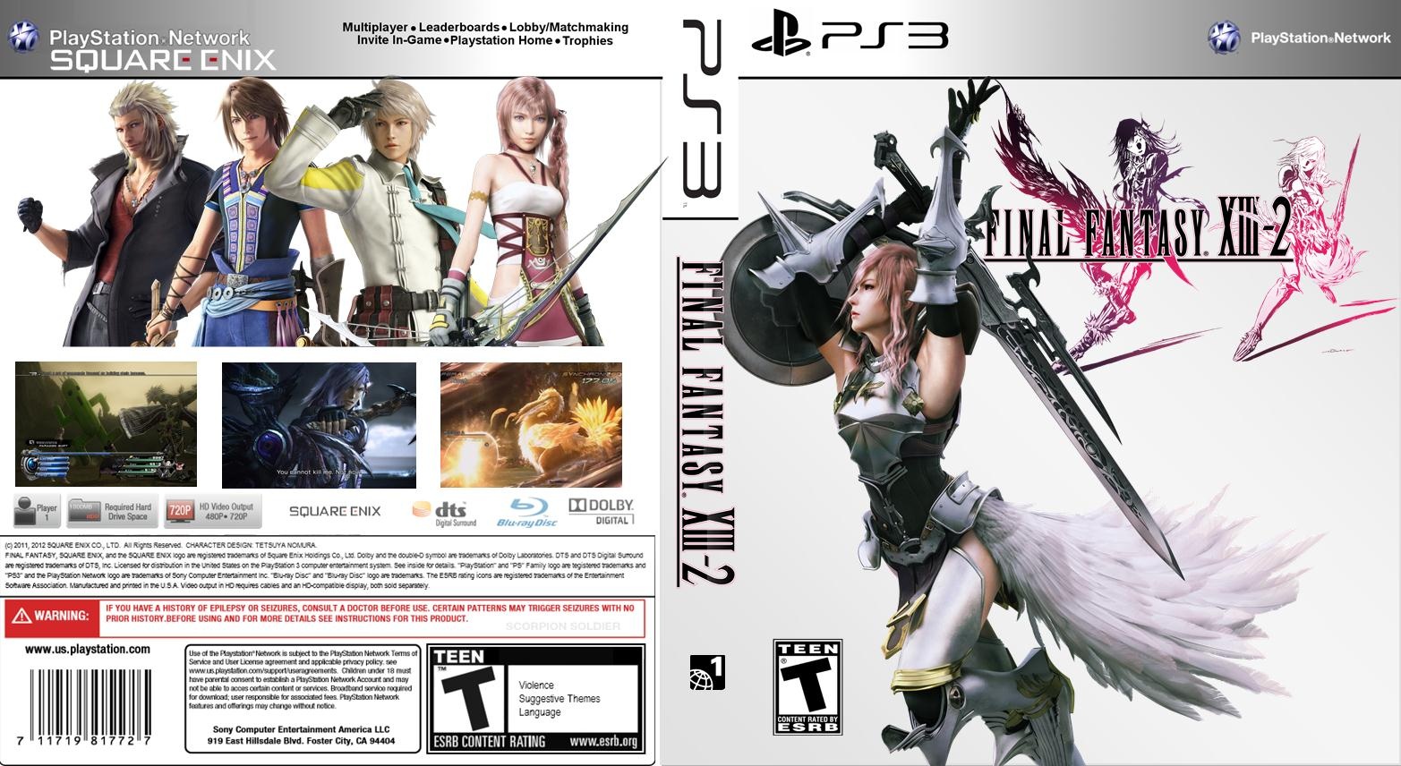
The colors really match the characters and create an atmoshere. I must say, I like the front with just Lightning and the logo better than the back. It is simple and adorable. Now the back is good too but it is a bit empty IMO. It could use some text above the screens and the characters are a bit off(Serah's hair touching the line above) they could be just a bit lower. I also think that a bit of shading would look good behind them, like a metalic hue. I like it ^^
Thanks,my friend.
about the back of the cover I wonna say that I do It on purpose I mean that if you look the sarah`s bow also Is in the touch with ps3 logo.
I am so happy that you give your idea. thanks again
Nice! I really like Snow on the back. The new positions look good. Now, the things I don't like... First of all, the space under the text is empty, you could have placed the rating there along with one or two more. Also, I think it should be "Save Cocoon" instead of "Save the Cocoon" but that is minor details. Again, I adore the front, you improved it a ton ;)
 FINAL FANTASY XIII-2. Box Cover Comments
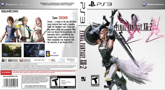
how is the box?
post your comments.
[ Reply ]
The colors really match the characters and create an atmoshere. I must say, I like the front with just Lightning and the logo better than the back. It is simple and adorable. Now the back is good too but it is a bit empty IMO. It could use some text above the screens and the characters are a bit off(Serah's hair touching the line above) they could be just a bit lower. I also think that a bit of shading would look good behind them, like a metalic hue. I like it ^^
[ Reply ]
Thanks,my friend.
about the back of the cover I wonna say that I do It on purpose I mean that if you look the sarah`s bow also Is in the touch with ps3 logo.
I am so happy that you give your idea. thanks again
[ Reply ]
THE box has been updated:
-the text added
-pictures resized
-gamespot score added
-and some the other fixes
[ Reply ]
Nice! I really like Snow on the back. The new positions look good. Now, the things I don't like... First of all, the space under the text is empty, you could have placed the rating there along with one or two more. Also, I think it should be "Save Cocoon" instead of "Save the Cocoon" but that is minor details. Again, I adore the front, you improved it a ton ;)
[ Reply ]
box updated......
[ Reply ]
@PEYMAN Nice!
[ Reply ]
Nice
[ Reply ]
nice.
[ Reply ]