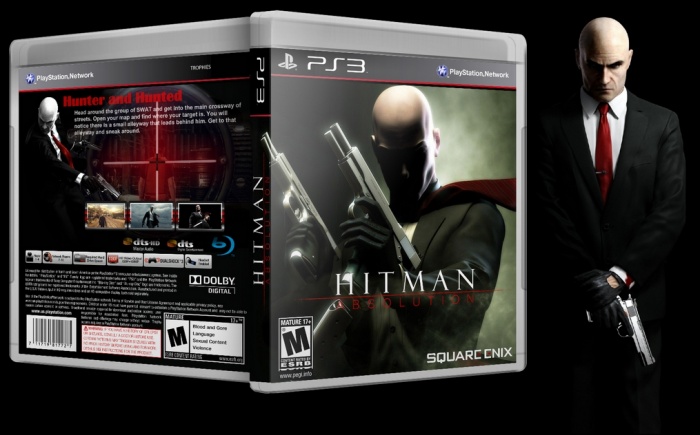
Nice choice of artwork for the front (I think it isn't official artwork for Hitman Absolution, but a good choice nevertheless) the logo could be a bit more visible though. The back feels a bit empty though.
Here are some of my suggestions:
* The scope seems rather dominant (the focus should be a bit more on 'Agent 47' imo.)
* The color scheme of the back, doesn't really match with the front (try bring the colors from the front or back also appear vice versa) * The gap between the synopsis and the screens seems a bit too big (making the screens a tad bigger, will solve that quite a bit)
* And finally, a better spacing/alignment of the info and a more fitting font and size for the header, would also improve the back quite a bit.
 Hitman: Absolution Box Cover Comments
Nice choice of artwork for the front (I think it isn't official artwork for Hitman Absolution, but a good choice nevertheless) the logo could be a bit more visible though. The back feels a bit empty though.
Here are some of my suggestions:
* The scope seems rather dominant (the focus should be a bit more on 'Agent 47' imo.)
* The color scheme of the back, doesn't really match with the front (try bring the colors from the front or back also appear vice versa) * The gap between the synopsis and the screens seems a bit too big (making the screens a tad bigger, will solve that quite a bit)
* And finally, a better spacing/alignment of the info and a more fitting font and size for the header, would also improve the back quite a bit.
[ Reply ]
ye koochooloo bahash movafegham , vali darkol kheyli greate , o_O
[ Reply ]
thx.
[ Reply ]
thx Bastart
[ Reply ]
Good
[ Reply ]
Thx..
[ Reply ]
Good Work . . .
[ Reply ]