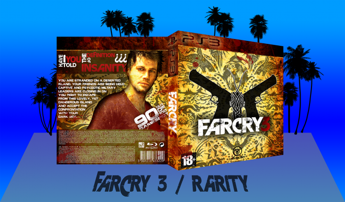
I'm pretty pleased with the outcome, lemme know what you guys think, ok?
Special credit goes to B.Serious for rendering the Tatau.
As always, view the printable for a high-res 2D.
Oh ye and a merry Christmas you all :D
 Far Cry 3 Box Cover Comments
Comment on Rarity's Far Cry 3 Box Art / Cover.

The front looks amazing!! The back could use some screenshots but other than that it's great :) worthy of a fav from me
[ Reply ]
Cheers! Kinda wanted to go without screenshots on this one, was not doable to place them right and still keep the look I wanted, so I chose not to place any.
[ Reply ]
Good job. Not a fan of the template, but it will probably grow on me.
[ Reply ]
Cheers! Ye I know the template is quite space consuming compared to other templates, might decrease its height a bit. Made a PS3 psd temp with the cover art dimensions on the forums so I'm able to modify every box' template to fit its cover..
[ Reply ]
Nice design! :)
[ Reply ]
Thanks! Really wanted to pursue something that looked different from the original and other boxarts I've seen for this game and still make it stand out..
[ Reply ]
WOWOWOWOOW SOSOSOS artistic GREAT JOB MAN I ILIKE SO
[ Reply ]
I don't really like the template and the strong black inner shadow on Jason, but the design itself is very appealling :)
[ Reply ]
link
Vaas lied.
But fantastic box.
[ Reply ]
Cheers :)
link
He didn't think of it himself as well tbf.. And it contradicts link but ye..
[ Reply ]
I am so glad to see someone trying something different with a FC3 box. Every box I've seen is just filled with Vaas and Jason in the same way doing the same shit. I think the front looks fantastic, I love how the focus of the box is entirely on the tatau. The back however really let's the rest of the design down IMO. It's a bit bland and I think the render of Jason doesn't suit it. Personally I would have gone with no characters at all on the box. But having said that, the box is still fantastic and I commend you for trying to do something different. Definitely deserves a HoF.
[ Reply ]
Also I have to say that the presentation of the box doesn't do justice to how great the box is. Whether it's the template or not I really think that it needs to be presented better.
[ Reply ]
Actually, I might've moved the Ubisoft logo to the left.
That's just me.
[ Reply ]
I had it on the right developing the box, but black didn't really show against the darker colours there and white was a little off with the rest of the front, hence my choice to put it in the middle..
[ Reply ]
Not too bad but few things stick out to me. First of all, it's stretched horizontally too much. The back's layout isn't my favorite. Everything is just too big; the render and text. I do like the colors and textures tough.
[ Reply ]