One of my favorite games of all time. So I decided to make a cover for it, and made it my first cover of 2013.
And view in full.
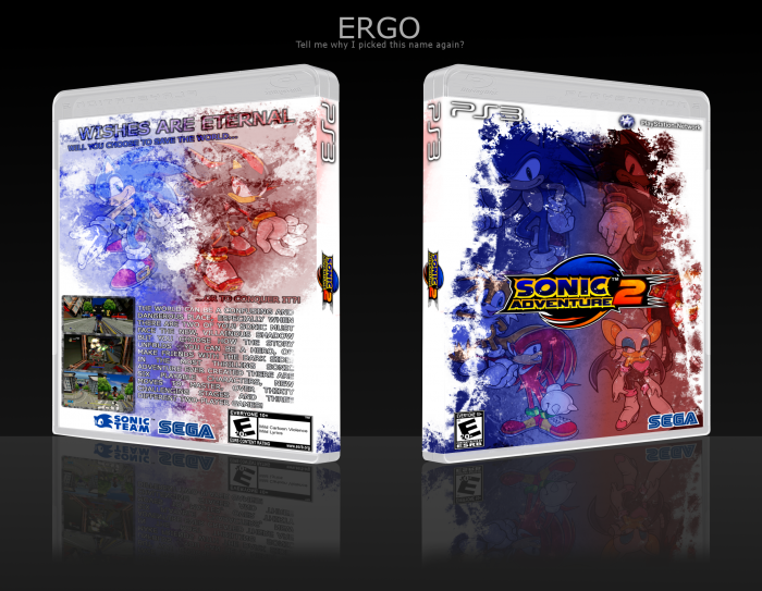
Credit time:
Sens & deiviuxs for PS3 render.
Leegion for PS3/PSN logos.
Sonic News Network for Screens/characters
Sonic Central for the logo (seriously, this website only has 2: Battle. When I'm level ten, that's the first thing I'm going to upload.)
Eggboy'13 for inspiration SA2 box.
[ Box updated on January 5th, 2013 ] [ original ]
 Sonic Adventure 2 Box Cover Comments
Comment on Ergo's Sonic Adventure 2 Box Art / Cover.
I really like the style you've got going, I think it flows and looks great, however there are a few issues I have with the box. Basically the front is fine, I have no issues at all, thumbs up
- I dont think the layout of the back works very well. I dont like the screen shots being stacked to the left, it may look better if they were positioned horizontally underneath Sonic and Shadow, and the description on the back was then centered and placed underneath
- I'm not a fan of the font, for the sort of artistic style you went with, an Arial looking font doesn't seem to fit in, and its a bit jarring, try maybe using Century Gothic for your normal writing and something like Impact (or similar) for the tagline?
-I also think Sonic and Shadow on the back shouldn't have any transparency, make them 100% so they're clearer and stand out, but keep the effects going on behind them
Other than that it's a solid box, if you can fix those changes I'd fave in a heartbeat!
[ Reply ]
First Bullet: I kind of agree, but that's the only way I could get the back to flow. If I moved the screenshots, the text would interfere with the ESRB/wouldn't fit.
Second Bullet: Personal preference for me: Arial > Century Gothic. And I personally think Impact wouldn't fit well.
Third Bullet: I'll try it out and see how it works.
[ Reply ]
Third Bullet: Doesn't fit the layout well.
[ Reply ]
Looks good, but the text on the back is a bit hard to see.
[ Reply ]