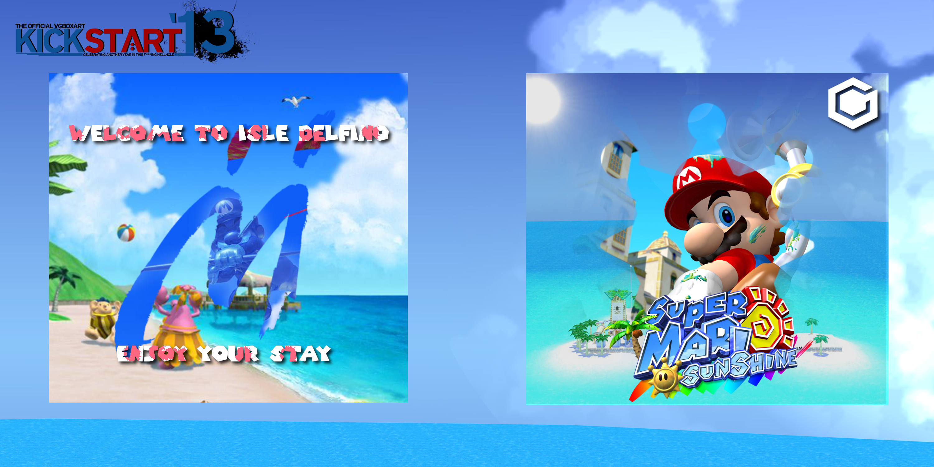
Don't really know what to say here.
Thanks to -ERGO
[ Box updated on January 27th, 2013 ] [ original ]
 Super Mario Sunshine Box Cover Comments
Comment on Takahashi2212's Super Mario Sunshine Box Art / Cover.
i like the front being nice and simple. i don't really like the pink you put in the font on the back. where r the developer logos? nice job though, faved + author faved
[ Reply ]
"Thanks to -ERGO"
Faved.
[ Reply ]
#hiddenadvertising.
[ Reply ]
#icwutudidthar
[ Reply ]
I really like the simplicity of it. Compliments it well.
[ Reply ]
Its hard to tell whats going on throughout the whole box. Everything looks cluttered, the presentation blends with the box and there is nothing eye-catching about, nothing that stands out. Hell even the front and the back are not parallel to each other. In the end the box looks really rushed. I was going to tell you all this when it was WIP but didnt think you were going to post it this soon.
[ Reply ]
Nice one!
[ Reply ]