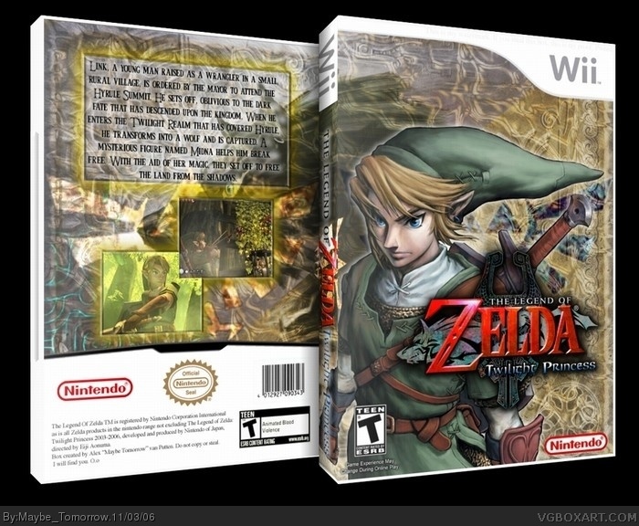
[ Box updated on November 3rd, 2006 ] [ original ]
 The Legend of Zelda: Twilight Princess Box Cover Comments
Comment on Maybe Tomorrow's The Legend of Zelda: Twilight Princess Box Art / Cover.
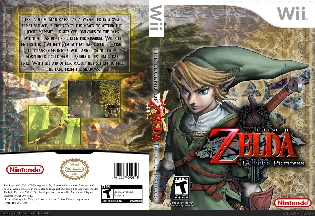
I worked for a very long time on this. If it wasnt for the help of EG, it would pretty much be crap. Same goes for the rest of my good boxes. Why I didnt thank him, I dont know.
The reason I dont put this stuff into 3D anymore is because it is always very small. I dont know why. If anyone knows of a better program(has to be free), then PM me with a link.
As usual, crits are welcome, but please. No bad ratings for no good reason.
[ Reply ]
Wonderful job, however im not so sure about all the busyness is the background, Zelda boxes are usually more simplistic. But wonderful work indeed! It seems like you worked hard on this :] 4.5/5
[ Reply ]
I was working for days. Sorry its so complex. I dont play Zelda, so I dont know what the box would look like.
[ Reply ]
hum... where are the players number logo and others stuff like this? 4/5
[ Reply ]
1#, Yeah it's a shame it's not in 3-D.
link
[ Reply ]
Great job Maybe tommorw .
Zelda boxart do have more simple cover just like this one link
4.5/5
[ Reply ]
Oh My god, thank you so much General!!!!! Now if youll excuse me, I have to go and rate all of your boxes(that I havent already) 5's. Right After I upload the box. : )
[ Reply ]
Now in 3D, all thanks to Electric General.
Why is everybody I meet on the internet so fucking awesome?
[ Reply ]
#4, What? Are you talking about that you guys use instead of ESRB logos? Because I am including everything that is needed in this box.
[ Reply ]
#9 I think he means like 1 or 2 player's .
[ Reply ]
Where can I find it?
[ Reply ]
goodjob but i think it needs more in game shots on the back maybe one or two more and shrink the text a little and it will look good. 4/5
[ Reply ]
#11, hum I don't know but you can search on google... it's 02H31 so I can't search but maybe tomorrow I will... (ahahahah)
[ Reply ]
#11 dragontear has some for the wii , Just PM him .
[ Reply ]
#7, It was easy making it 3-D, did'nt have to put all those fives in my collection, guess I can't complain though :)
[ Reply ]
#12, Dont complain about other peoples boxes until you make one yourself. I'm God compared to you.
[ Reply ]
What is wrong with you all? 5/5 not 4.5 Oh my god! its not simplistic! oh no! WHAT IS WRONG WITH YOU. I believe change is good. Maybe Tomorrow, thank you for etching this masterpiece of work and i will now on look at all of your boxes, give them good ratings, but give them as examples of a masterwork and not throw them to getther like i do. You have influenced me and I thank you. You rock!
[ Reply ]
this is awesome. the only thing i dont like is the glow around teh boxes on the back cover. it kinda looks pee-ish. maybe you could make it teh same color as the gold tint on the front?
[ Reply ]
#17, Thank you. I'ts nice to know that I have an actual "fan"
Do you want my autograph?(j/k)
#18, Learn to spell "the" correctly.
[ Reply ]
#19, its my most common typo.
but seriously. the glow is pee-colored.
[ Reply ]
#20, That is called Gold.
[ Reply ]
#21, looks like pee to me.
if you wanted to use gold, then you couldve used the color from the front.
[ Reply ]
looks very good. the cover pic of link is sick.
[ Reply ]
Why isn't this in the HoF??? +fav
[ Reply ]
I think the background is nice, but you could have done more with the front by adding something unusual rather than just placing Link slightly to the left. Moreover, I think there is probably too much writing on the back since people mainly just stare at the screenshots rather than read a paragraph. It is also slightly irrelevant since it tells the story of Twilight Princess, rather than describing the gameplay and innovation that Nintendo is known for. Overall, it is a good attempt.
[ Reply ]
Bumpage ftw!
#24 Because there are ALOT of things wrong with this box as mentioned in previous comments.
[ Reply ]
#22 if your pee looks like that you are either eating too much protein or not drinking enough water.
anyway, this is a good box... most boxes have flaws, but the only thing i would change is the back.. maybe some sort of design around the top and left edge? im not sure.
[ Reply ]
Love it, love it, love it.
This would be a much better original release of the artwork IMHO than what Nintendo provided.
Keep it up!
[ Reply ]