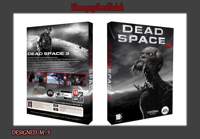
THIS MY NEW Design
LOGO DEAD SAPCE 3 FROM : miami_vice
HOPE LIKE IT
don't forget add favorite
[ Box updated on July 30th, 2013 ] [ original ]
 Dead Space 3 Box Cover Comments
Comment on m.s's Dead Space 3 Box Art / Cover.
Not that bad. The approach is cool.
But there are some flaws that I need to criticize:
This black lightning around the box looks weird. Get rid of it.
There is too much boring text on the back. Make it smaller, shorten it and spice things up with test magazine quotes.
The picture on the top looks displaced as it does not fit with the style of the rest of the box. Try to add some colors to the rest or make it black and white as well.
Everything else is quite okay.
[ Reply ]
thanks for Checking and Criticisms aldimon
[ Reply ]