![]() »
»
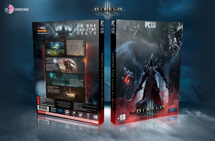
Please See Full Size : 3500*2373
[ Box updated on December 24th, 2013 ] [ original ]
 Diablo 3: Reaper Of Souls Box Cover Comments
Comment on shirazihaa's Diablo 3: Reaper Of Souls Box Art / Cover.
nice work bro! :D
[ Reply ]
Thanks ;)
[ Reply ]
nice work just like always
[ Reply ]
Thanks
[ Reply ]
realy realy nice
[ Reply ]
Thanks ;)
[ Reply ]
As always nice!!!:)
[ Reply ]
Thanks
[ Reply ]
Looks Great . . .
[ Reply ]
Thanks Matin ;)
[ Reply ]
It looks very professional, I love the vertical arrangement you made on the back!
[ Reply ]
Agree.
[ Reply ]
Thanks Benyamin ;) Thanks Oddmania ;)
[ Reply ]
Nice really like the cover
[ Reply ]
Thanks
[ Reply ]
nice
[ Reply ]
Thanks Brother ;)
[ Reply ]
Really nice. Great job!
[ Reply ]
Thanks ;)
[ Reply ]
It's great, really.
but, maybe you could stop using the same quoted line ("I'M BLOWN AWAY") for your each box.
[ Reply ]
I like it. The Blizzard logo is actually red for the Diablo games. I think it also would been better if Malthael was bigger on the front, cause it just looks like there's blank space near the top. Lastly I think the spine of the box could be improved. The logo just looks like it was a quick 2min job. :)
[ Reply ]
thanks ;)
[ Reply ]
Nice :-)
[ Reply ]
Congrats Amin . . .
[ Reply ]
Thanks Matin ;)
[ Reply ]
Not sure how I missed this. This is great. Extra points for hi-res quality.
[ Reply ]
thanks brother ;)
[ Reply ]
well deserved..congrats.
[ Reply ]
thanks benyamin ;)
[ Reply ]
Very Nice :)
[ Reply ]
excelent !!
[ Reply ]
nice ok
[ Reply ]