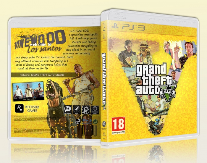
The front is well worked and I admire that you've gone for a completely different colour-scheme.
The back is really poor in contrast to the front though as you've chosen to do your copywriting in, arguably, one of the worst fonts ever. Always look what official fonts are being used for things and make sure it's something that's easily readable like Helvetica, Arial or Tahoma, your standard Sans Serif * fonts.
Some more game screenshots on the back that are different to the images you've already used on the front would be perfect too and would really bring the cover to life and give it more character.
Watch about re-colouring official logos, also. It looks as if you have a yellow-ish tint on the front PEGI 18 logo, as well as the logos on the back. Make sure official stuff like that is always above everything else on your layer palette, or at least not covered by a major colour.
( * For those that don't know, 'Sans Serif' refers to fonts that don't have little flicks or lines on the edges of letters such as Times New Roman, a 'Serif' font. The flicks and lines are called serifs, and 'sans' is a friend word meaning 'without' - so you can easily remember that fonts like Helvetica, Arial and Tahoma are without flicks and lines. )
 Grand Theft Auto 5 Box Cover Comments
creative job
well done
[ Reply ]
The front is well worked and I admire that you've gone for a completely different colour-scheme.
The back is really poor in contrast to the front though as you've chosen to do your copywriting in, arguably, one of the worst fonts ever. Always look what official fonts are being used for things and make sure it's something that's easily readable like Helvetica, Arial or Tahoma, your standard Sans Serif * fonts.
Some more game screenshots on the back that are different to the images you've already used on the front would be perfect too and would really bring the cover to life and give it more character.
Watch about re-colouring official logos, also. It looks as if you have a yellow-ish tint on the front PEGI 18 logo, as well as the logos on the back. Make sure official stuff like that is always above everything else on your layer palette, or at least not covered by a major colour.
( * For those that don't know, 'Sans Serif' refers to fonts that don't have little flicks or lines on the edges of letters such as Times New Roman, a 'Serif' font. The flicks and lines are called serifs, and 'sans' is a friend word meaning 'without' - so you can easily remember that fonts like Helvetica, Arial and Tahoma are without flicks and lines. )
[ Reply ]
* French word, sorry. Not friend.
[ Reply ]
Not a bad box, nice idea.
[ Reply ]
Nice dood disign
[ Reply ]
Very creative and very different style for GTA. Great job!
[ Reply ]
NIIIIIIIIIIIIIIICE
[ Reply ]