![]() »
»
Template By Joeseye
Happy New Year
 The Hunger Games: Catching Fire Box Cover Comments
Comment on ghost68's The Hunger Games: Catching Fire Box Art / Cover.
Nice, nice ;) add printable
[ Reply ]
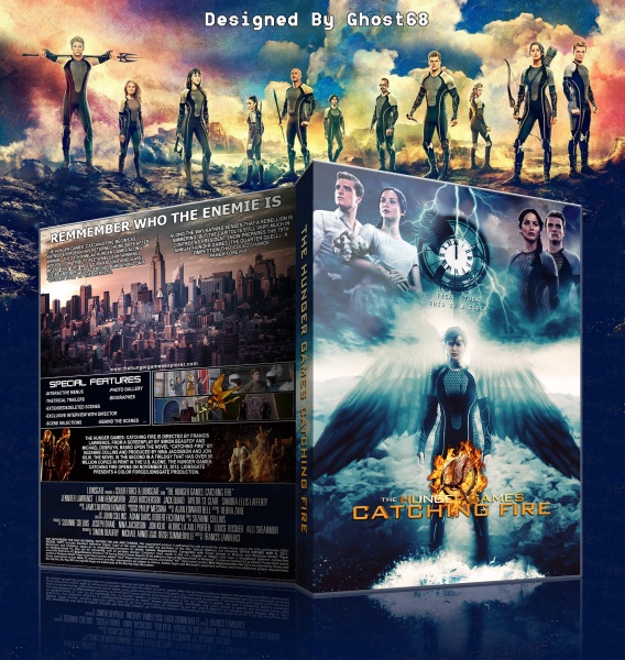
I like the direction you took this even though the front has a very similar composition to your spiderman box but I'll ignore that for now.
I think this has a lot of potential! While the arrangement on the front is nice I feel having Katniss and Peetar more than once isn't necessary at all. I think using Peetar once and then other tributes up there would have been a lot more effective. I also think the wings behind Katniss could be solid instead of faded and you probably could have found a more appealing shot of Katniss on the bottom haha. Putting the actor's names on the front at the top could add a more official look as well!
The bottom half of the back is well done but overall needs to have a better color scheme (perhaps to match the front a bit more?), not sure if that city used is actually the capitol but I'd still mess with it or change it to something else to fit a little better. The text is littered with spelling mistakes and awkward sentences, I'm not sure if english is your first language but if you can, find an official summary to use back there! I also don't think I'd separate the text in the middle like that around the tower. Finally the header font is a bit plain, maybe find a similar font to the logo and match the effect!
This is a good start here and I think, if improved, it could be really great man!
[ Reply ]
Oh My God . Thanks Dude
[ Reply ]
looks cool
[ Reply ]
The blending is not that good on the front, and it is kinda repetitive... the back is decent but the top text doesn't really fit.
[ Reply ]
ok professional man
[ Reply ]
Thanks Guys
[ Reply ]
Congrats . . .
[ Reply ]
Congrats, this is awesome
[ Reply ]
Congrats Man ;)
[ Reply ]
Congrats bro ! ♥ :)
[ Reply ]