[ Buy BioShock at Amazon ] By WickedGamer1 37 on February 19th, 2007 No Printable Available BioShock Box Cover Comments Comment on WickedGamer1's BioShock Box Art / Cover. Cancel Reply WickedGamer1 37 [ 1 decade ago ] started off as mass effect, them moved on to Def Jam Icon, then, Burnout 5. needless to say, those projects all failed so that this could be. plz like. full view pwns, btw. [ Reply ] E_G 39 [ 1 decade ago ] I like how you made your front more original and I dig the and dignity of it. [ Reply ] blinkofeye 39 [ 1 decade ago ] I just think that color of the letters on the back should be little darker, its too bright. But everything else excellent [ Reply ] Radioactive Bob 38 [ 1 decade ago ] Wow...This is an excellent piece of work Wicked. The front is very original and the back is more than interesting. [ Reply ] MasterChief2829 3 [ 1 decade ago ] 5/5, looks great! I hope the official box art looks just as good. [ Reply ] Ratchetcomand 8 [ 1 decade ago ] Very awesome 5/5 . [ Reply ] finalfantaseer22 43 [ 1 decade ago ] i agree with blinky, the font is kinda weird. i think it would look better silver like the logo. [ Reply ] cooljay1622 37 [ 1 decade ago ] i like it. [ Reply ] shadysaiyan 42 [ 1 decade ago ] this is put together awesomely. love the texture on the front and the back is great to, looks SOOOOO official! 5/5 [ Reply ] Macedonia Mafia 3 [ 1 decade ago ] Eww Moldy, lol. Looks awsome, 5/5 [ Reply ] Dustgunner 33 [ 1 decade ago ] This is excellent. 5/5 [ Reply ] xIAMHUNTERx 43 [ 1 decade ago ] I really like how the Big Daddy blends into the background. The only problem is that there's a little too much text on the back. [ Reply ] jevangod 50 [ 1 decade ago ] Love it yo be on the look out tommorrow morning for my Assassin's Creed Collectors edition box on the PS [ Reply ] E_G 39 [ 1 decade ago ] #13, Please don't advertise yourself like that, some would find it annoying. [ Reply ] jevangod 50 [ 1 decade ago ] #14, Im not advertising it Im just telling him to check it out. People do that on my box all the time and I dont mind [ Reply ] XBOX BOY 1 [ 1 decade ago ] its god 5/5+fav [ Reply ] Galaheart 1 [ 1 decade ago ] 5/5+fav! [ Reply ] RollingCarnage 1 [ 1 decade ago ] good [ Reply ]
 BioShock Box Cover Comments
started off as mass effect, them moved on to Def Jam Icon, then, Burnout 5.
needless to say, those projects all failed so that this could be.
plz like.
full view pwns, btw.
[ Reply ]
I like how you made your front more original and I dig the and dignity of it.
[ Reply ]
I just think that color of the letters on the back should be little darker, its too bright. But everything else excellent
[ Reply ]
Wow...This is an excellent piece of work Wicked. The front is very original and the back is more than interesting.
[ Reply ]
5/5, looks great! I hope the official box art looks just as good.
[ Reply ]
Very awesome 5/5 .
[ Reply ]
i agree with blinky, the font is kinda weird. i think it would look better silver like the logo.
[ Reply ]
i like it.
[ Reply ]
this is put together awesomely. love the texture on the front and the back is great to, looks SOOOOO official! 5/5
[ Reply ]
Eww Moldy, lol.
Looks awsome, 5/5
[ Reply ]
This is excellent. 5/5
[ Reply ]
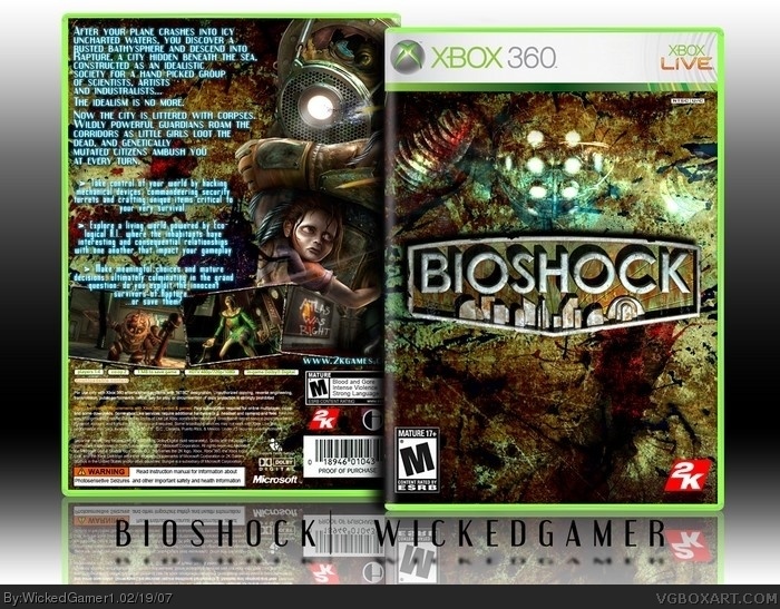
I really like how the Big Daddy blends into the background. The only problem is that there's a little too much text on the back.
[ Reply ]
Love it yo be on the look out tommorrow morning for my Assassin's Creed Collectors edition box on the PS
[ Reply ]
#13, Please don't advertise yourself like that, some would find it annoying.
[ Reply ]
#14, Im not advertising it Im just telling him to check it out. People do that on my box all the time and I dont mind
[ Reply ]
its god 5/5+fav
[ Reply ]
5/5+fav!
[ Reply ]
good
[ Reply ]